> ## Documentation Index
> Fetch the complete documentation index at: https://docs.wandb.ai/llms.txt
> Use this file to discover all available pages before exploring further.
> 機械学習の実験からプロットを作成してトラッキングします。
# 実験からプロットを作成してトラッキングする
W\&B Models では、`wandb.plot` の method を使用して、`wandb.Run.log()` でチャートをトラッキングできます。これには、トレーニング中に時間の経過とともに変化するチャートも含まれます。custom charting framework の詳細については、[custom charts walkthrough](/ja/models/app/features/custom-charts/walkthrough/) を参照してください。
### 基本チャート
W\&B のチャートを作成するには、次の手順に従います。
1. `wandb.Table` オブジェクトを作成し、可視化したいデータを追加します。
2. W\&B に組み込まれている [ヘルパー関数](/ja/models/ref/python/custom-charts) のいずれかを使用して、プロットを生成します。
3. `wandb.Run.log()` を使ってプロットをログします。
以下の基本チャートを使用すると、メトリクスや結果を基本的に可視化できます。
任意の軸上で接続され順序付けられた点のリストからなる、カスタム折れ線グラフをログします。
```python theme={null}
import wandb
with wandb.init() as run:
data = [[x, y] for (x, y) in zip(x_values, y_values)]
table = wandb.Table(data=data, columns=["x", "y"])
run.log(
{
"my_custom_plot_id": wandb.plot.line(
table, "x", "y", title="Custom Y versus X line plot"
)
}
)
```
これを使用すると、任意の2次元に対する曲線をログできます。2つの値のリストを互いにプロットする場合は、それぞれのリストの値の数が完全に一致している必要があります。たとえば、各点には x と y の両方が必要です。
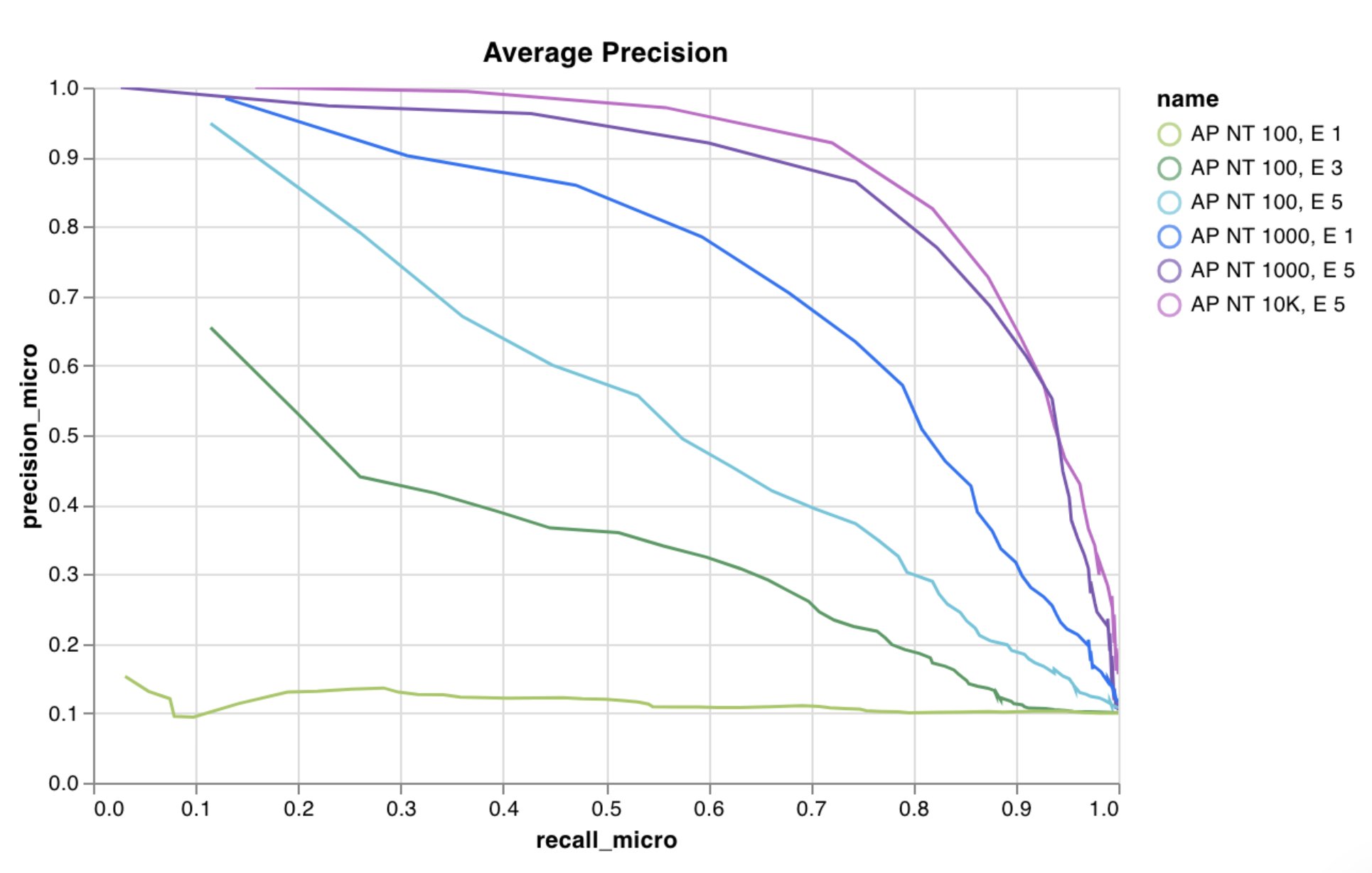 詳細は、[W\&B を使用したカスタム折れ線グラフの作成](https://wandb.ai/wandb/plots/reports/Custom-Line-Plots--VmlldzoyNjk5NTA)レポートを参照してください。
[コードを実行する](https://tiny.cc/custom-charts)
任意の x 軸と y 軸に対応する点 (x, y) のリストとして、カスタム散布図をログします。
```python theme={null}
import wandb
with wandb.init() as run:
data = [[x, y] for (x, y) in zip(class_x_scores, class_y_scores)]
table = wandb.Table(data=data, columns=["class_x", "class_y"])
run.log({"my_custom_id": wandb.plot.scatter(table, "class_x", "class_y")})
```
これは、任意の2つの次元に散布図の点をログする際に使用できます。2つの値のリストを互いに対応させてプロットする場合は、それぞれのリストに含まれる値の数が完全に一致している必要があります。たとえば、各点には x と y の両方が必要です。
詳細は、[W\&B を使用したカスタム折れ線グラフの作成](https://wandb.ai/wandb/plots/reports/Custom-Line-Plots--VmlldzoyNjk5NTA)レポートを参照してください。
[コードを実行する](https://tiny.cc/custom-charts)
任意の x 軸と y 軸に対応する点 (x, y) のリストとして、カスタム散布図をログします。
```python theme={null}
import wandb
with wandb.init() as run:
data = [[x, y] for (x, y) in zip(class_x_scores, class_y_scores)]
table = wandb.Table(data=data, columns=["class_x", "class_y"])
run.log({"my_custom_id": wandb.plot.scatter(table, "class_x", "class_y")})
```
これは、任意の2つの次元に散布図の点をログする際に使用できます。2つの値のリストを互いに対応させてプロットする場合は、それぞれのリストに含まれる値の数が完全に一致している必要があります。たとえば、各点には x と y の両方が必要です。
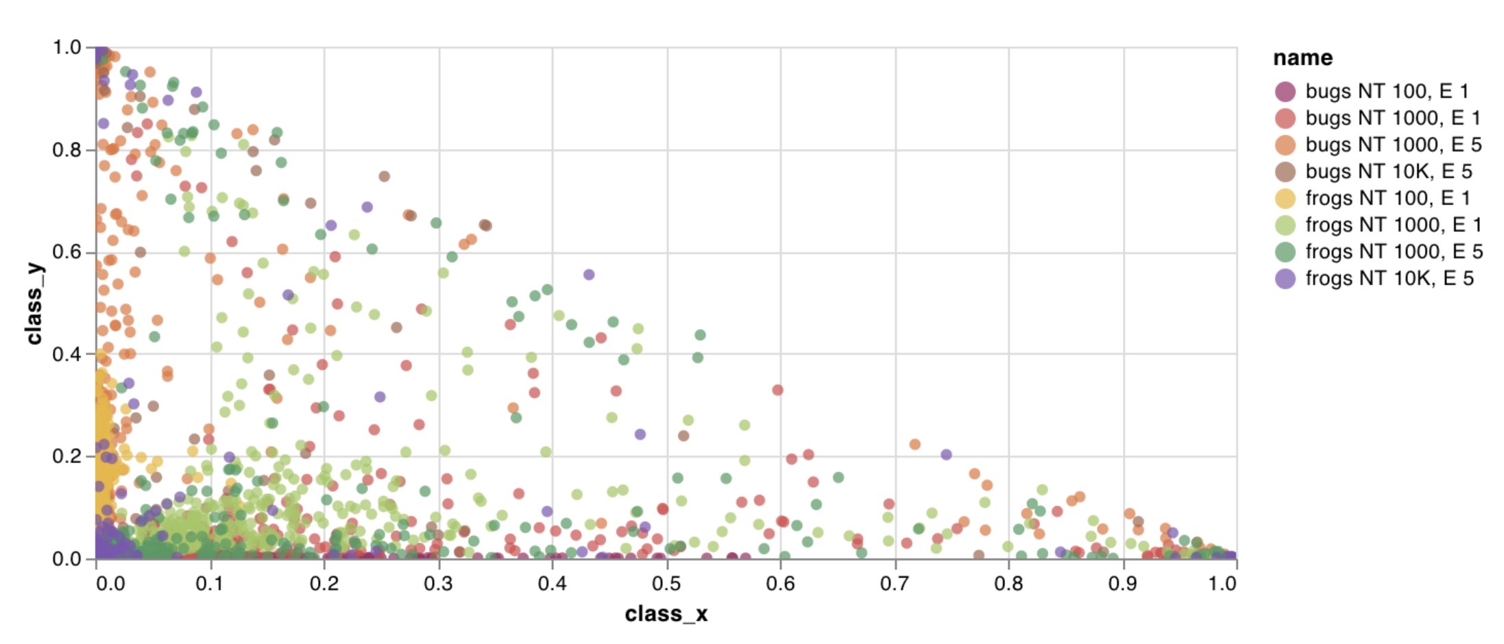 詳細は、[Creating Custom Scatter Plots With W\&B](https://wandb.ai/wandb/plots/reports/Custom-Scatter-Plots--VmlldzoyNjk5NDQ) レポートを参照してください。
[コードを実行](https://tiny.cc/custom-charts)
数行で、カスタムの棒グラフ (ラベル付きの値のリストを棒で表したもの) を直接ログできます:
```python theme={null}
import wandb
with wandb.init() as run:
data = [[label, val] for (label, val) in zip(labels, values)]
table = wandb.Table(data=data, columns=["label", "value"])
run.log(
{
"my_bar_chart_id": wandb.plot.bar(
table, "label", "value", title="Custom bar chart"
)
}
)
```
これを使用すると、任意の棒グラフをログできます。リスト内のラベル数と値の数は、完全に一致している必要があります。各データポイントには、ラベルと値の両方が必要です。
詳細は、[Creating Custom Scatter Plots With W\&B](https://wandb.ai/wandb/plots/reports/Custom-Scatter-Plots--VmlldzoyNjk5NDQ) レポートを参照してください。
[コードを実行](https://tiny.cc/custom-charts)
数行で、カスタムの棒グラフ (ラベル付きの値のリストを棒で表したもの) を直接ログできます:
```python theme={null}
import wandb
with wandb.init() as run:
data = [[label, val] for (label, val) in zip(labels, values)]
table = wandb.Table(data=data, columns=["label", "value"])
run.log(
{
"my_bar_chart_id": wandb.plot.bar(
table, "label", "value", title="Custom bar chart"
)
}
)
```
これを使用すると、任意の棒グラフをログできます。リスト内のラベル数と値の数は、完全に一致している必要があります。各データポイントには、ラベルと値の両方が必要です。
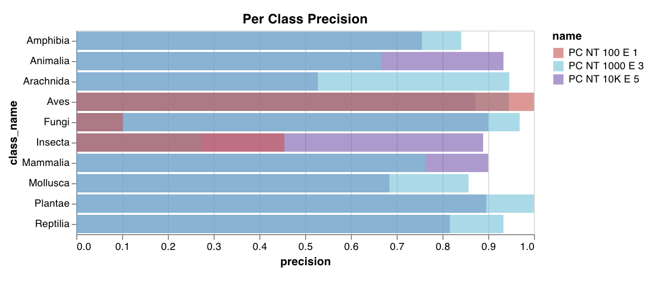 詳細は、[カスタム棒グラフ](https://wandb.ai/wandb/plots/reports/Custom-Bar-Charts--VmlldzoyNzExNzk)レポートをご覧ください。
[コードを実行する](https://tiny.cc/custom-charts)
数行のコードで、カスタムヒストグラム (値のリストを、出現回数または出現頻度に応じてビンに振り分けたもの) をそのままログできます。予測の信頼度スコアのリスト (`scores`) がある場合、分布は次のように可視化できます。
```python theme={null}
import wandb
with wandb.init() as run:
data = [[s] for s in scores]
table = wandb.Table(data=data, columns=["scores"])
run.log({"my_histogram": wandb.plot.histogram(table, "scores", title="Histogram")})
```
これを使用して、任意のヒストグラムをログできます。`data` はリストのリストで、行と列からなる 2D 配列を表すことを想定しています。
詳細は、[カスタム棒グラフ](https://wandb.ai/wandb/plots/reports/Custom-Bar-Charts--VmlldzoyNzExNzk)レポートをご覧ください。
[コードを実行する](https://tiny.cc/custom-charts)
数行のコードで、カスタムヒストグラム (値のリストを、出現回数または出現頻度に応じてビンに振り分けたもの) をそのままログできます。予測の信頼度スコアのリスト (`scores`) がある場合、分布は次のように可視化できます。
```python theme={null}
import wandb
with wandb.init() as run:
data = [[s] for s in scores]
table = wandb.Table(data=data, columns=["scores"])
run.log({"my_histogram": wandb.plot.histogram(table, "scores", title="Histogram")})
```
これを使用して、任意のヒストグラムをログできます。`data` はリストのリストで、行と列からなる 2D 配列を表すことを想定しています。
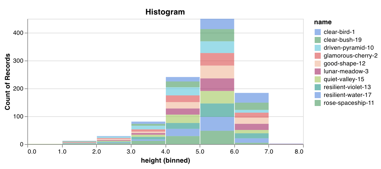 詳細は、[Creating Custom Histograms With W\&B](https://wandb.ai/wandb/plots/reports/Custom-Histograms--VmlldzoyNzE0NzM) レポートを参照してください。
[コードを実行する](https://tiny.cc/custom-charts)
1 組の共通の x-y 軸上に、複数の線、または複数の異なる x-y 座標ペアのリストをプロットします:
```python theme={null}
import wandb
with wandb.init() as run:
run.log(
{
"my_custom_id": wandb.plot.line_series(
xs=[0, 1, 2, 3, 4],
ys=[[10, 20, 30, 40, 50], [0.5, 11, 72, 3, 41]],
keys=["metric Y", "metric Z"],
title="Two Random Metrics",
xname="x units",
)
}
)
```
x と y の点の数は、必ず完全に一致している必要があります。複数の y 値のリストに対して 1 つの x 値のリストを指定することも、各 y 値のリストに対して個別の x 値のリストを指定することもできます。
詳細は、[Creating Custom Histograms With W\&B](https://wandb.ai/wandb/plots/reports/Custom-Histograms--VmlldzoyNzE0NzM) レポートを参照してください。
[コードを実行する](https://tiny.cc/custom-charts)
1 組の共通の x-y 軸上に、複数の線、または複数の異なる x-y 座標ペアのリストをプロットします:
```python theme={null}
import wandb
with wandb.init() as run:
run.log(
{
"my_custom_id": wandb.plot.line_series(
xs=[0, 1, 2, 3, 4],
ys=[[10, 20, 30, 40, 50], [0.5, 11, 72, 3, 41]],
keys=["metric Y", "metric Z"],
title="Two Random Metrics",
xname="x units",
)
}
)
```
x と y の点の数は、必ず完全に一致している必要があります。複数の y 値のリストに対して 1 つの x 値のリストを指定することも、各 y 値のリストに対して個別の x 値のリストを指定することもできます。
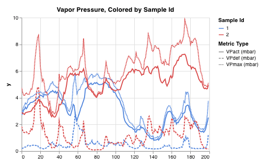 詳細は、[Custom Multi-Line Plots](https://wandb.ai/wandb/plots/reports/Custom-Multi-Line-Plots--VmlldzozOTMwMjU) レポートを参照してください。
### モデル評価用チャート
これらのプリセットチャートには組み込みの `wandb.plot()` method が用意されており、スクリプトから直接すばやくチャートをログして、UI で必要な情報を正確に確認できます。
1行で[Precision-Recall curve](https://scikit-learn.org/stable/modules/generated/sklearn.metrics.precision_recall_curve.html#sklearn.metrics.precision_recall_curve)を作成できます:
```python theme={null}
import wandb
with wandb.init() as run:
# ground_truth は正解ラベルのリストで、predictions は予測スコアのリストです。
# たとえば、ground_truth = [0, 1, 1, 0]、predictions = [0.1, 0.4, 0.35, 0.8] です。
ground_truth = [0, 1, 1, 0]
predictions = [0.1, 0.4, 0.35, 0.8]
run.log({"pr": wandb.plot.pr_curve(ground_truth, predictions)})
```
コードから次の情報にアクセスできる場合は、いつでもこれをログできます。
* 一連のサンプルに対するモデルの予測スコア (`predictions`) 。
* それらのサンプルに対応する正解ラベル (`ground_truth`) 。
* (任意) ラベルまたはクラス名のリスト。たとえば、ラベルインデックス 0 が cat、1 が dog、2 が bird を表す場合は、`labels=["cat", "dog", "bird"]`。
* (任意) プロットに表示するラベルのサブセット (リスト形式のまま) 。
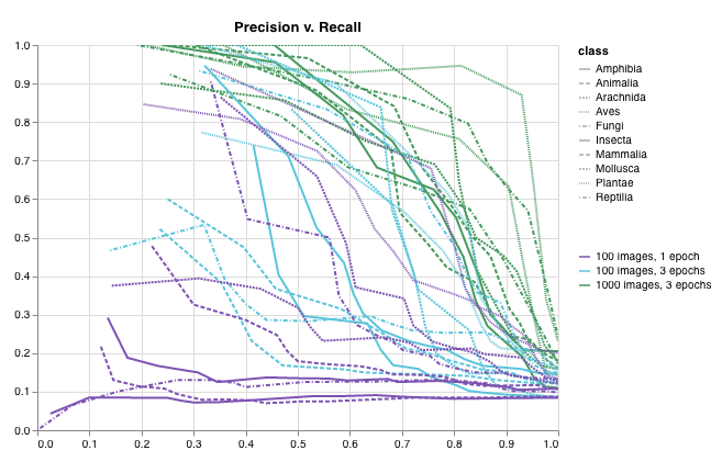 詳細は、[W\&B で適合率-再現率曲線をプロットする](https://wandb.ai/wandb/plots/reports/Plot-Precision-Recall-Curves--VmlldzoyNjk1ODY)レポートを参照してください。
[コードを実行する](https://colab.research.google.com/drive/1mS8ogA3LcZWOXchfJoMrboW3opY1A8BY?usp=sharing)
1行で [ROC曲線](https://scikit-learn.org/stable/modules/generated/sklearn.metrics.roc_curve.html#sklearn.metrics.roc_curve) を作成できます:
```python theme={null}
import wandb
with wandb.init() as run:
# ground_truth は正解ラベルのリストで、predictions は予測スコアのリストです。
# たとえば、ground_truth = [0, 1, 1, 0]、predictions = [0.1, 0.4, 0.35, 0.8] です。
ground_truth = [0, 1, 1, 0]
predictions = [0.1, 0.4, 0.35, 0.8]
run.log({"roc": wandb.plot.roc_curve(ground_truth, predictions)})
```
コードから次の情報にアクセスできる場合は、いつでもこれをログできます。
* ある一連のサンプルに対するモデルの予測スコア (`predictions`) 。
* それらのサンプルに対応する正解ラベル (`ground_truth`) 。
* (任意) ラベルまたはクラス名のリスト。たとえば、ラベルインデックス 0 が cat、1 が dog、2 が bird を表す場合は、`labels=["cat", "dog", "bird"]` です。
* (任意) プロットに可視化する、これらのラベルのサブセット (リスト形式のまま) 。
詳細は、[W\&B で適合率-再現率曲線をプロットする](https://wandb.ai/wandb/plots/reports/Plot-Precision-Recall-Curves--VmlldzoyNjk1ODY)レポートを参照してください。
[コードを実行する](https://colab.research.google.com/drive/1mS8ogA3LcZWOXchfJoMrboW3opY1A8BY?usp=sharing)
1行で [ROC曲線](https://scikit-learn.org/stable/modules/generated/sklearn.metrics.roc_curve.html#sklearn.metrics.roc_curve) を作成できます:
```python theme={null}
import wandb
with wandb.init() as run:
# ground_truth は正解ラベルのリストで、predictions は予測スコアのリストです。
# たとえば、ground_truth = [0, 1, 1, 0]、predictions = [0.1, 0.4, 0.35, 0.8] です。
ground_truth = [0, 1, 1, 0]
predictions = [0.1, 0.4, 0.35, 0.8]
run.log({"roc": wandb.plot.roc_curve(ground_truth, predictions)})
```
コードから次の情報にアクセスできる場合は、いつでもこれをログできます。
* ある一連のサンプルに対するモデルの予測スコア (`predictions`) 。
* それらのサンプルに対応する正解ラベル (`ground_truth`) 。
* (任意) ラベルまたはクラス名のリスト。たとえば、ラベルインデックス 0 が cat、1 が dog、2 が bird を表す場合は、`labels=["cat", "dog", "bird"]` です。
* (任意) プロットに可視化する、これらのラベルのサブセット (リスト形式のまま) 。
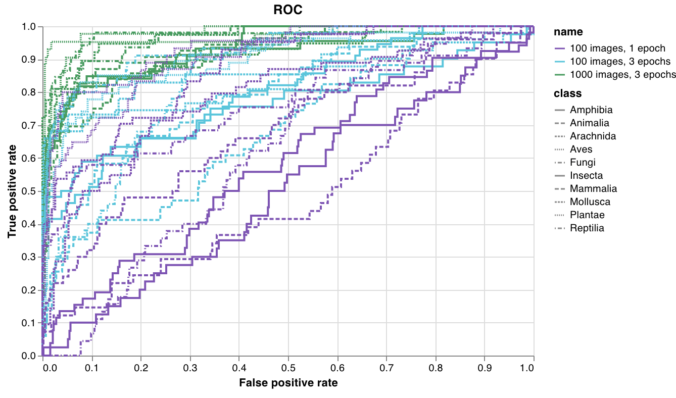 詳細は、[W\&B で ROC 曲線をプロットする](https://wandb.ai/wandb/plots/reports/Plot-ROC-Curves--VmlldzoyNjk3MDE)レポートを参照してください。
[コードを実行する](https://colab.research.google.com/github/wandb/examples/blob/master/colabs/wandb-log/Plot_ROC_Curves_with_W%26B.ipynb)
1行で多クラスの[混同行列](https://scikit-learn.org/stable/auto_examples/model_selection/plot_confusion_matrix.html)を作成できます。
```python theme={null}
import wandb
cm = wandb.plot.confusion_matrix(
y_true=ground_truth, preds=predictions, class_names=class_names
)
with wandb.init() as run:
run.log({"conf_mat": cm})
```
コード内で次の情報にアクセスできる箇所であれば、どこでもこれをログできます。
* 一連のサンプルに対するモデルの予測ラベル (`preds`) または正規化された確率スコア (`probs`) 。確率の形状は (サンプル数、クラス数) である必要があります。指定できるのは確率または予測のどちらか一方のみで、両方は指定できません。
* それらのサンプルに対応する正解ラベル (`y_true`) 。
* `class_names` に含まれる、ラベルまたはクラス名を文字列で並べた完全なリスト。たとえば、インデックス 0 が `cat`、1 が `dog`、2 が `bird` の場合は、`class_names=["cat", "dog", "bird"]` です。
詳細は、[W\&B で ROC 曲線をプロットする](https://wandb.ai/wandb/plots/reports/Plot-ROC-Curves--VmlldzoyNjk3MDE)レポートを参照してください。
[コードを実行する](https://colab.research.google.com/github/wandb/examples/blob/master/colabs/wandb-log/Plot_ROC_Curves_with_W%26B.ipynb)
1行で多クラスの[混同行列](https://scikit-learn.org/stable/auto_examples/model_selection/plot_confusion_matrix.html)を作成できます。
```python theme={null}
import wandb
cm = wandb.plot.confusion_matrix(
y_true=ground_truth, preds=predictions, class_names=class_names
)
with wandb.init() as run:
run.log({"conf_mat": cm})
```
コード内で次の情報にアクセスできる箇所であれば、どこでもこれをログできます。
* 一連のサンプルに対するモデルの予測ラベル (`preds`) または正規化された確率スコア (`probs`) 。確率の形状は (サンプル数、クラス数) である必要があります。指定できるのは確率または予測のどちらか一方のみで、両方は指定できません。
* それらのサンプルに対応する正解ラベル (`y_true`) 。
* `class_names` に含まれる、ラベルまたはクラス名を文字列で並べた完全なリスト。たとえば、インデックス 0 が `cat`、1 が `dog`、2 が `bird` の場合は、`class_names=["cat", "dog", "bird"]` です。
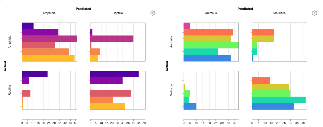 詳細は、[混同行列: 使い方と例](https://wandb.ai/wandb/plots/reports/Confusion-Matrix--VmlldzozMDg1NTM)レポートを参照してください。
[コードを実行する](https://colab.research.google.com/github/wandb/examples/blob/master/colabs/wandb-log/Log_a_Confusion_Matrix_with_W%26B.ipynb)
詳細は、[混同行列: 使い方と例](https://wandb.ai/wandb/plots/reports/Confusion-Matrix--VmlldzozMDg1NTM)レポートを参照してください。
[コードを実行する](https://colab.research.google.com/github/wandb/examples/blob/master/colabs/wandb-log/Log_a_Confusion_Matrix_with_W%26B.ipynb)
### インタラクティブなカスタムチャート
より細かくカスタマイズするには、組み込みの[カスタム チャート プリセット](/ja/models/app/features/custom-charts/walkthrough/)を調整するか、新しいプリセットを作成してから、チャートを保存します。チャート ID を使用すると、スクリプトから直接そのカスタムプリセットにデータをログできます。
```python theme={null}
import wandb
# プロットする列を含む表を作成します。
table = wandb.Table(data=data, columns=["step", "height"])
# 表の列をチャートのフィールドにマッピングします。
fields = {"x": "step", "value": "height"}
# 表を使用して新しいカスタム チャート プリセットにデータを入力します。
# 保存済みのカスタム チャート プリセットを使用するには、vega_spec_name を変更してください。
# タイトルを編集するには、string_fields を変更してください。
my_custom_chart = wandb.plot_table(
vega_spec_name="carey/new_chart",
data_table=table,
fields=fields,
string_fields={"title": "Height Histogram"},
)
with wandb.init() as run:
# カスタム チャートをログします。
run.log({"my_custom_chart": my_custom_chart})
```
[コードを実行する](https://tiny.cc/custom-charts)
### Matplotlib と Plotly のプロット
`wandb.plot()` で W\&B の[カスタムチャート](/ja/models/app/features/custom-charts/walkthrough/)を使う代わりに、[matplotlib](https://matplotlib.org/) や [Plotly](https://plotly.com/) で生成したチャートをログできます。
```python theme={null}
import wandb
import matplotlib.pyplot as plt
with wandb.init() as run:
# シンプルな matplotlib プロットを作成する。
plt.figure()
plt.plot([1, 2, 3, 4])
plt.ylabel("some interesting numbers")
# プロットを W&B にログする。
run.log({"chart": plt})
```
`matplotlib` のプロットまたは図オブジェクトを `wandb.Run.log()` に渡すだけです。デフォルトでは、プロットは [Plotly](https://plot.ly/) のプロットに変換されます。プロットを画像としてログしたい場合は、`wandb.Image` にプロットを渡してください。Plotly のチャートも直接受け付けています。
「You attempted to log an empty plot」のようなエラーが表示される場合は、`fig = plt.figure()` を使って図をプロットとは別に保持し、その後 `wandb.Run.log()` の call で `fig` をログしてください。
### カスタムHTMLをW\&B Tablesにログする
W\&Bでは、Plotly と Bokeh のインタラクティブなチャートを HTML としてログし、Tables に追加できます。
#### Plotly の figure を HTML として Tables にログする
Plotly の figure を HTML に変換すると、インタラクティブな Plotly チャートを W\&B Tables にログできます。
```python theme={null}
import wandb
import plotly.express as px
# 新しいrunを初期化する。
with wandb.init(project="log-plotly-fig-tables", name="plotly_html") as run:
# 表を作成する。
table = wandb.Table(columns=["plotly_figure"])
# Plotly figureのパスを作成する。
path_to_plotly_html = "./plotly_figure.html"
# Plotly figureの例。
fig = px.scatter(x=[0, 1, 2, 3, 4], y=[0, 1, 4, 9, 16])
# Plotly figureをHTMLに書き出す。
# auto_playをFalseに設定すると、アニメーション付きのPlotlyチャートが
# 表内で自動再生されるのを防ぐことができる。
fig.write_html(path_to_plotly_html, auto_play=False)
# PlotlyのfigureをHTMLファイルとして表に追加する。
table.add_data(wandb.Html(path_to_plotly_html))
# 表をログする。
run.log({"test_table": table})
```
#### Bokeh の図を HTML として Tables にログする
インタラクティブな Bokeh チャートは、HTML に変換することで W\&B Tables にログできます。
```python theme={null}
from scipy.signal import spectrogram
import holoviews as hv
import panel as pn
from scipy.io import wavfile
import numpy as np
from bokeh.resources import INLINE
hv.extension("bokeh", logo=False)
import wandb
def save_audio_with_bokeh_plot_to_html(audio_path, html_file_name):
sr, wav_data = wavfile.read(audio_path)
duration = len(wav_data) / sr
f, t, sxx = spectrogram(wav_data, sr)
spec_gram = hv.Image((t, f, np.log10(sxx)), ["Time (s)", "Frequency (hz)"]).opts(
width=500, height=150, labelled=[]
)
audio = pn.pane.Audio(wav_data, sample_rate=sr, name="Audio", throttle=500)
slider = pn.widgets.FloatSlider(end=duration, visible=False)
line = hv.VLine(0).opts(color="white")
slider.jslink(audio, value="time", bidirectional=True)
slider.jslink(line, value="glyph.location")
combined = pn.Row(audio, spec_gram * line, slider).save(html_file_name)
html_file_name = "audio_with_plot.html"
audio_path = "hello.wav"
save_audio_with_bokeh_plot_to_html(audio_path, html_file_name)
wandb_html = wandb.Html(html_file_name)
with wandb.init(project="audio_test") as run:
my_table = wandb.Table(columns=["audio_with_plot"], data=[[wandb_html]])
run.log({"audio_table": my_table})
```