;
};
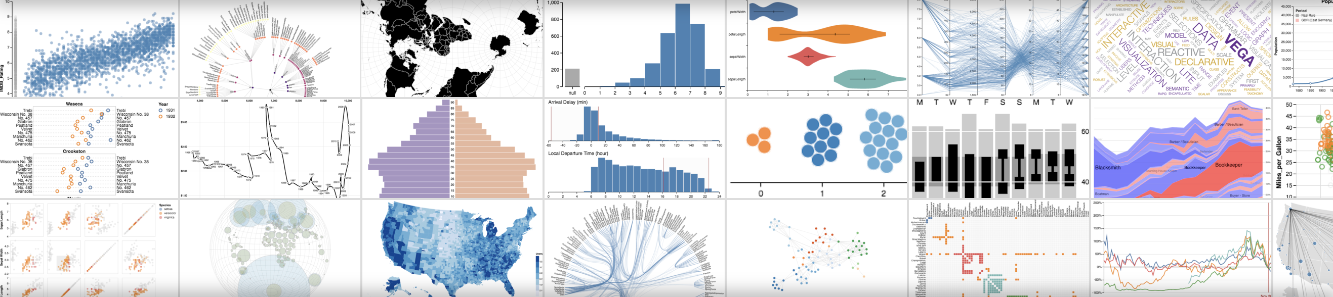
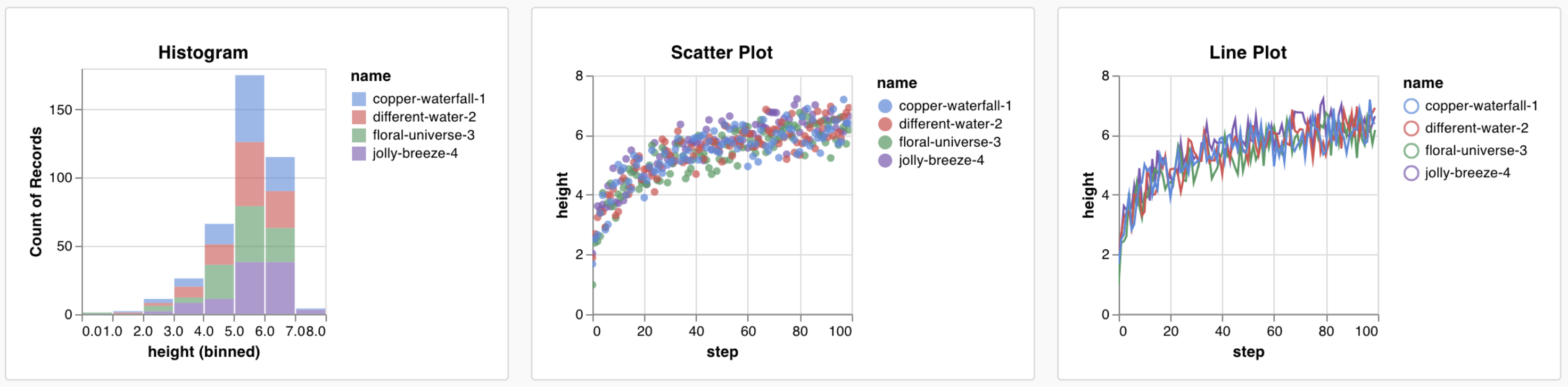
Custom charts let you visualize logged data exactly how you want, beyond the defaults W\&B provides. Use them when you need to plot relationships, distributions, or model evaluation metrics that the built-in panels don't cover, such as precision-recall curves, custom histograms, or overlays of multiple experiments.
Create custom charts in your W\&B project. Log arbitrary tables of data and visualize them exactly how you want. Control details of fonts, colors, and tooltips with [Vega](https://vega.github.io/vega/).
* Code: Try an example [Colab notebook](https://tiny.cc/custom-charts).
* Video: Watch a [walkthrough video](https://www.youtube.com/watch?v=3-N9OV6bkSM).
* Example: Quick Keras and Sklearn [demo notebook](https://colab.research.google.com/drive/1g-gNGokPWM2Qbc8p1Gofud0_5AoZdoSD?usp=sharing).
## How it works
1. **Log data**: From your script, log [config](/models/track/config/) and summary data.
2. **Customize the chart**: Pull in logged data with a [GraphQL](https://graphql.org) query. Visualize the results of your query with [Vega](https://vega.github.io/vega/), a visualization grammar.
3. **Log the chart**: Call your own preset from your script with `wandb.plot_table()`.
If you don't see the expected data, the column you're looking for might not be logged in the selected runs. Save your chart, go back out to the runs table, and verify selected runs using the **eye** icon.
## Log charts from a script
The following sections describe two ways to log charts directly from your training script: built-in chart presets that cover common visualizations, and custom presets that let you reuse your own Vega specifications.
### Built-in presets
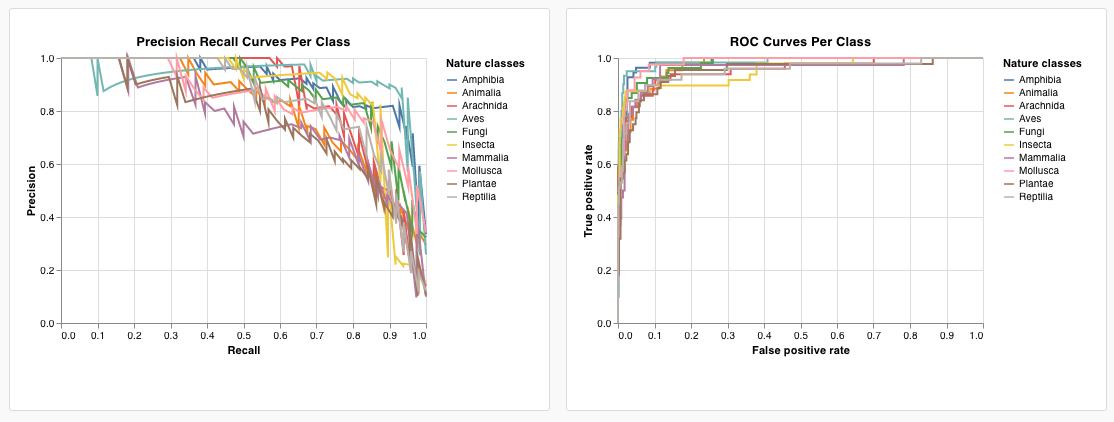
W\&B has several built-in chart presets that you can log directly from your script. These include line plots, scatter plots, bar charts, histograms, PR curves, and ROC curves.
`wandb.plot.line()`
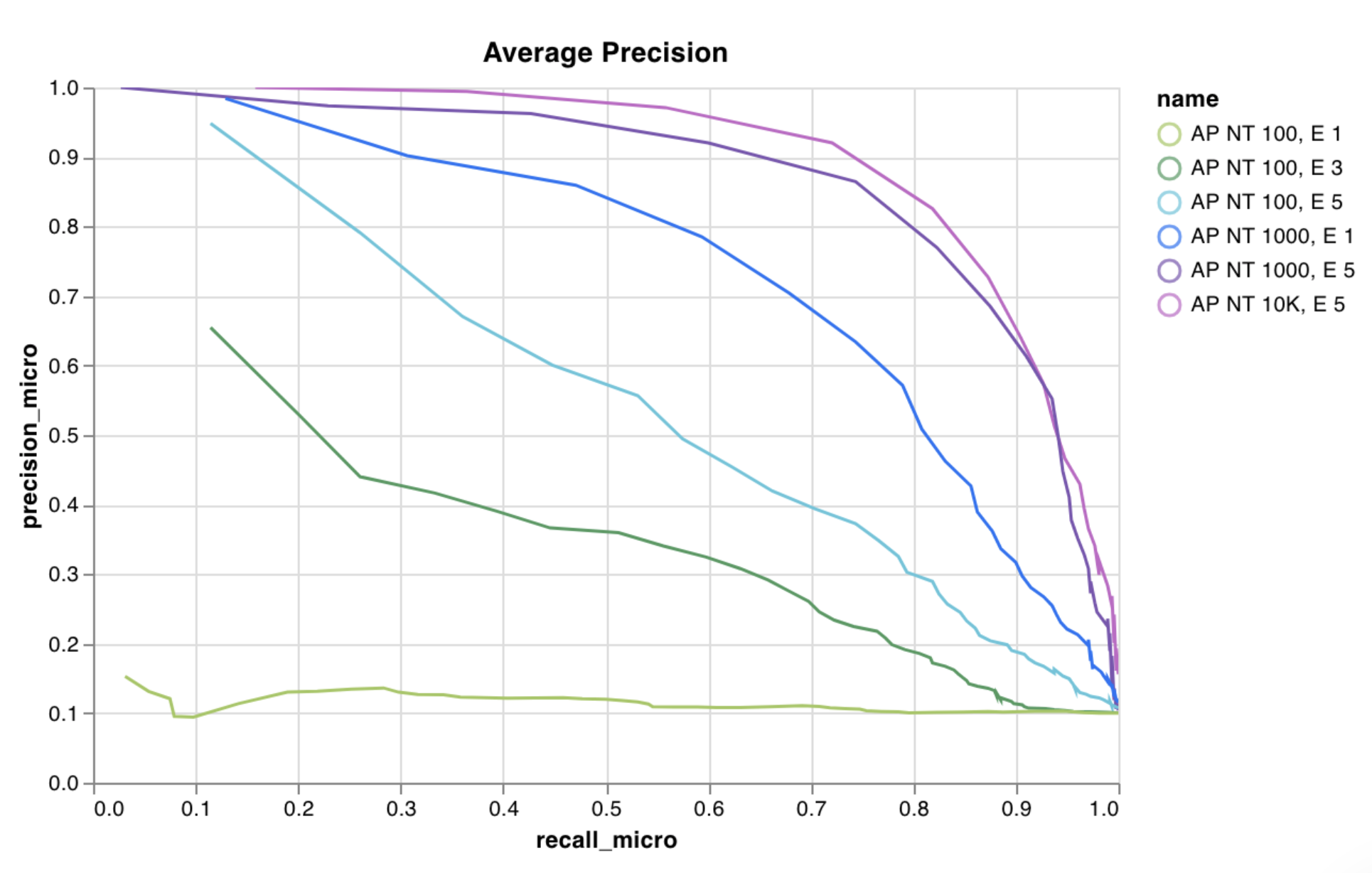
Log a custom line plot, a list of connected and ordered points (x,y) on arbitrary axes x and y.
```python theme={null}
with wandb.init() as run:
data = [[x, y] for (x, y) in zip(x_values, y_values)]
table = wandb.Table(data=data, columns=["x", "y"])
run.log(
{
"my_custom_plot_id": wandb.plot.line(
table, "x", "y", title="Custom Y vs X Line Plot"
)
}
)
```
A line plot logs curves on any two dimensions. If you plot two lists of values against each other, the number of values in the lists must match exactly (for example, each point must have an x and a y).
[See an example report](https://wandb.ai/wandb/plots/reports/Custom-Line-Plots--VmlldzoyNjk5NTA) or [try an example Google Colab notebook](https://tiny.cc/custom-charts).
`wandb.plot.scatter()`
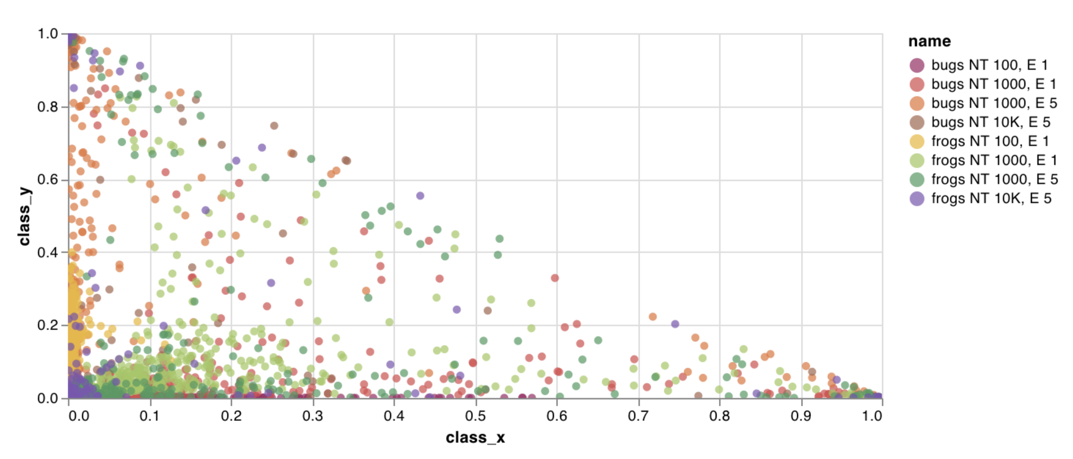
Log a custom scatter plot, a list of points (x, y) on a pair of arbitrary axes x and y.
```python theme={null}
with wandb.init() as run:
data = [[x, y] for (x, y) in zip(class_x_prediction_scores, class_y_prediction_scores)]
table = wandb.Table(data=data, columns=["class_x", "class_y"])
run.log({"my_custom_id": wandb.plot.scatter(table, "class_x", "class_y")})
```
You can use this to log scatter points on any two dimensions. Note that if you're plotting two lists of values against each other, the number of values in the lists must match exactly (for example, each point must have an x and a y).
[See an example report](https://wandb.ai/wandb/plots/reports/Custom-Scatter-Plots--VmlldzoyNjk5NDQ) or [try an example Google Colab notebook](https://tiny.cc/custom-charts).
`wandb.plot.bar()`
Log a custom bar chart (a list of labeled values as bars):
```python theme={null}
with wandb.init() as run:
data = [[label, val] for (label, val) in zip(labels, values)]
table = wandb.Table(data=data, columns=["label", "value"])
run.log(
{
"my_bar_chart_id": wandb.plot.bar(
table, "label", "value", title="Custom Bar Chart"
)
}
)
```
You can use this to log arbitrary bar charts. Note that the number of labels and values in the lists must match exactly (for example, each data point must have both).
[See an example report](https://wandb.ai/wandb/plots/reports/Custom-Bar-Charts--VmlldzoyNzExNzk) or [try an example Google Colab notebook](https://tiny.cc/custom-charts).
`wandb.plot.histogram()`
Log a custom histogram (sort a list of values into bins by count or frequency of occurrence). For example, suppose you have a list of prediction confidence scores (`scores`) and want to visualize their distribution:
```python theme={null}
with wandb.init() as run:
data = [[s] for s in scores]
table = wandb.Table(data=data, columns=["scores"])
run.log({"my_histogram": wandb.plot.histogram(table, "scores", title=None)})
```
You can use this to log arbitrary histograms. Note that `data` is a list of lists, intended to support a 2D array of rows and columns.
[See an example report](https://wandb.ai/wandb/plots/reports/Custom-Histograms--VmlldzoyNzE0NzM) or [try an example Google Colab notebook](https://tiny.cc/custom-charts).
`wandb.plot.pr_curve()`
Create a [Precision-Recall curve](https://scikit-learn.org/stable/modules/generated/sklearn.metrics.precision_recall_curve.html#sklearn.metrics.precision_recall_curve) in one line:
```python theme={null}
with wandb.init() as run:
plot = wandb.plot.pr_curve(ground_truth, predictions, labels=None, classes_to_plot=None)
run.log({"pr": plot})
```
You can log this whenever your code has access to:
* A model's predicted scores (`predictions`) on a set of examples.
* The corresponding ground truth labels (`ground_truth`) for those examples.
* `labels` (Optional): A list of the labels or class names (`labels=["cat", "dog", "bird"...]` if label index 0 means cat, 1 = dog, 2 = bird, and so on).
* `classes_to_plot` (Optional): A subset (still in list format) of the labels to visualize in the plot.
[See an example report](https://wandb.ai/wandb/plots/reports/Plot-Precision-Recall-Curves--VmlldzoyNjk1ODY) or [try an example Google Colab notebook](https://colab.research.google.com/drive/1mS8ogA3LcZWOXchfJoMrboW3opY1A8BY?usp=sharing).
`wandb.plot.roc_curve()`
Create an [ROC curve](https://scikit-learn.org/stable/modules/generated/sklearn.metrics.roc_curve.html#sklearn.metrics.roc_curve) in one line:
```python theme={null}
with wandb.init() as run:
# ground_truth is a list of true labels, predictions is a list of predicted scores
ground_truth = [0, 1, 0, 1, 0, 1]
predictions = [0.1, 0.4, 0.35, 0.8, 0.7, 0.9]
# Create the ROC curve plot
# labels is an optional list of class names, classes_to_plot is an optional subset of those labels to visualize
plot = wandb.plot.roc_curve(
ground_truth, predictions, labels=None, classes_to_plot=None
)
run.log({"roc": plot})
```
You can log this whenever your code has access to:
* A model's predicted scores (`predictions`) on a set of examples.
* The corresponding ground truth labels (`ground_truth`) for those examples.
* `labels` (Optional): A list of the labels or class names (`labels=["cat", "dog", "bird"...]` if label index 0 means cat, 1 = dog, 2 = bird, and so on).
* `classes_to_plot` (Optional): A subset (still in list format) of these labels to visualize on the plot.
[See an example report](https://wandb.ai/wandb/plots/reports/Plot-ROC-Curves--VmlldzoyNjk3MDE) or [try an example Google Colab notebook](https://colab.research.google.com/drive/1_RMppCqsA8XInV_jhJz32NCZG6Z5t1RO?usp=sharing).
### Custom presets
Tweak a built-in preset, or create a new preset, then save the chart. Use the chart ID to log data to that custom preset directly from your script. [Try an example Google Colab notebook](https://tiny.cc/custom-charts).
```python theme={null}
# Create a table with the columns to plot
table = wandb.Table(data=data, columns=["step", "height"])
# Map from the table's columns to the chart's fields
fields = {"x": "step", "value": "height"}
# Use the table to populate the new custom chart preset
# To use your own saved chart preset, change the vega_spec_name
my_custom_chart = wandb.plot_table(
vega_spec_name="carey/new_chart",
data_table=table,
fields=fields,
)
```
## Log data
Before you can visualize anything in a custom chart, your script must log the underlying data in a format the chart editor can query. You can log the following data types from your script and use them in a custom chart:
* **Config**: Initial settings of your experiment (your independent variables). This includes any named fields you've logged as keys to `wandb.Run.config` at the start of your training. For example, `wandb.Run.config.learning_rate = 0.0001`.
* **Summary**: Single values logged during training (your results or dependent variables). For example, `wandb.Run.log({"val_acc" : 0.8})`. If you write to this key multiple times during training through `wandb.Run.log()`, the summary is set to the final value of that key.
* **History**: The full time series of the logged scalar is available to the query through the `history` field.
* **summaryTable**: If you need to log a list of multiple values, use a `wandb.Table()` to save that data, then query it in your custom panel.
* **historyTable**: If you need to see the history data, then query `historyTable` in your custom chart panel. Each time you call `wandb.Table()` or log a custom chart, you're creating a new table in history for that step.
### Log a custom table
Use `wandb.Table()` to log your data as a 2D array. Typically, each row of this table represents one data point, and each column denotes the relevant fields or dimensions for each data point that you want to plot. As you configure a custom panel, the whole table is accessible through the named key passed to `wandb.Run.log()` (`custom_data_table` in the following example). The individual fields are accessible through the column names (`x`, `y`, and `z`). You can log tables at multiple time steps throughout your experiment. The maximum size of each table is 10,000 rows. [Try an example Google Colab notebook](https://tiny.cc/custom-charts).
```python theme={null}
with wandb.init() as run:
# Logging a custom table of data
my_custom_data = [[x1, y1, z1], [x2, y2, z2]]
run.log(
{"custom_data_table": wandb.Table(data=my_custom_data, columns=["x", "y", "z"])}
)
```
## Customize the chart
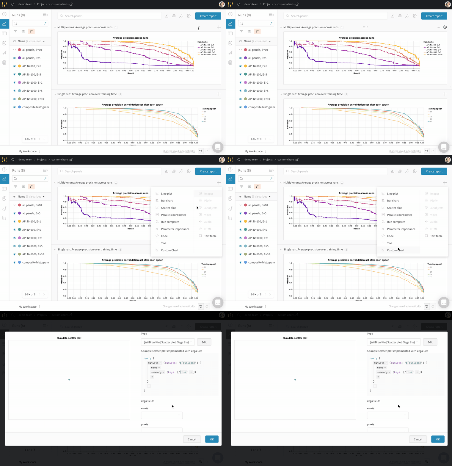
After you log data, build a chart in the W\&B app by choosing which logged values to pull in and how to render them. Add a new custom chart to get started, then edit the query to select data from your visible runs. The query uses [GraphQL](https://graphql.org) to fetch data from the config, summary, and history fields in your runs.
You can also ask ARIA to create a custom chart from a description. Open ARIA from your project workspace and describe the chart you want:
### Build the GraphQL query
The custom chart editor runs a GraphQL query over the runs you selected in the project workspace or report. In the query editor, add the fields you need. You can pick from `config`, `summary`, `history`, `summaryTable`, and `historyTable` so you don't need to write the query from scratch for most cases.
Each source in the query maps to different logged data:
* **Config** pulls [run configuration](/models/track/config/) values (hyperparameters and other settings).
* **Summary** pulls [summary](/models/track/log/) values. By default, the summary for a key logged with `wandb.Run.log()` holds the last value written for that key. To use a different aggregate, call `wandb.Run.define_metric(..., summary=...)` with `"min"`, `"max"`, `"mean"`, `"best"`, or `"none"`. To set a value directly, assign `wandb.Run.summary["key"] = value`.
* **History** pulls scalar time series from run history (for example, `loss` or `accuracy` at each step). Use **history** when you need the full curve, not only the final number.
* **`summaryTable`** loads a [`wandb.Table`](/models/ref/python/data-types/table) from the run summary. Use it when the table you care about is stored as a single snapshot on the run (for example, one confusion matrix you log once at the end).
* **`historyTable`** loads a [`wandb.Table`](/models/ref/python/data-types/table) from run history. Each time you log a table with `wandb.Run.log()`, you add another step to run history that includes that table. Use **`historyTable`** when the table changes over time or when you want to enable the step selector in the custom chart editor (see [How do you show a step slider in a custom chart?](/support/models/articles/how-do-you-show-a-step-slider-in-a-custo)).
For **`summaryTable`** and **`historyTable`**, set **`tableKey`** to the dictionary key you used inside `wandb.Run.log()`, not to a column name inside the [`wandb.Table`](/models/ref/python/data-types/table).
The following examples cover common cases:
* Plot columns from a table you log at each step (for example, a PR curve): add **`historyTable`**, set **`tableKey`** to your logged key (for example, `pr_curve`), then map table columns in **Chart fields**. See the [custom charts tutorial](/models/app/features/custom-charts/walkthrough).
* Plot columns from a table that lives in a summary (for example, class scores for a composite histogram): add **`summaryTable`**, set **`tableKey`** to that key (the tutorial uses `class_scores`). See [Bonus: composite histograms](/models/app/features/custom-charts/walkthrough#bonus-composite-histograms).
* Plot a scalar metric over training steps: add the metric from **history**. If you only add it from **summary**, the chart shows a single value per run.
**Chart field names**
After the query runs, **Chart fields** lists columns you can bind into the Vega spec. Names often begin with `runSets_` and reflect the selected query fields. Choose them from the dropdowns next to each `${field:...}` placeholder instead of typing them manually.
If a column never appears, confirm the key exists on the selected runs, open the run page to verify how the data was logged, and check whether **`summaryTable`** or **`historyTable`** matches that logging pattern.
Custom charts use this GraphQL-based panel query. [Query panels](/models/app/features/panels/query-panels) use a different expression language and are documented separately.
### Custom visualizations
Select a **Chart** in the upper right corner to start with a default preset. Next, select **Chart fields** to map the data you're pulling in from the query to the corresponding fields in your chart.
The following image shows how to select a metric and then map it into the bar chart fields.
### Edit Vega
Click **Edit** at the top of the panel to go into [Vega](https://vega.github.io/vega/) edit mode. Here you can define a [Vega specification](https://vega.github.io/vega/docs/specification/) that creates an interactive chart in the UI. You can change any aspect of the chart. For example, you can change the title, pick a different color scheme, or show curves as a series of points instead of as connected lines. You can also make changes to the data itself, such as using a Vega transform to bin an array of values into a histogram. The panel preview updates interactively, so you can see the effect of your changes as you edit the Vega spec or query. For more information, see the [Vega documentation and tutorials](https://vega.github.io/vega/).
**Field references**
To pull data into your chart from W\&B, add template strings of the form `"${field:}"` anywhere in your Vega spec. This creates a dropdown in the **Chart fields** area on the right side, which you can use to select a query result column to map into Vega.
To set a default value for a field, use this syntax: `"${field::}"`
### Save chart presets
Save a preset to reuse the same Vega definition across panels and projects instead of recreating it each time. Apply changes to a specific visualization panel with the button at the bottom of the modal. Alternatively, you can save the Vega spec to reuse it elsewhere in your project. To save the reusable chart definition, click **Save as** at the top of the Vega editor and give your preset a name.
## Reports and guides
The following reports show end-to-end examples and deeper explorations of custom charts in practice.
* [The W\&B Machine Learning Visualization IDE](https://wandb.ai/wandb/posts/reports/The-W-B-Machine-Learning-Visualization-IDE--VmlldzoyNjk3Nzg)
* [Visualizing NLP Attention Based Models](https://wandb.ai/kylegoyette/gradientsandtranslation2/reports/Visualizing-NLP-Attention-Based-Models-Using-Custom-Charts--VmlldzoyNjg2MjM)
* [Visualizing The Effect of Attention on Gradient Flow](https://wandb.ai/kylegoyette/gradientsandtranslation/reports/Visualizing-The-Effect-of-Attention-on-Gradient-Flow-Using-Custom-Charts--VmlldzoyNjg1NDg)
* [Logging arbitrary curves](https://wandb.ai/stacey/presets/reports/Logging-Arbitrary-Curves--VmlldzoyNzQyMzA)
## Common use cases
Custom charts are useful when the default panels can't represent what you need to show. For example:
* Customizing bar plots with error bars
* Showing model validation metrics that require custom x-y coordinates (like precision-recall curves)
* Overlaying data distributions from two different models or experiments as histograms
* Showing changes in a metric through snapshots at multiple points during training
* Creating a unique visualization not yet available in W\&B and sharing it with others
 ## How it works
1. **Log data**: From your script, log [config](/models/track/config/) and summary data.
2. **Customize the chart**: Pull in logged data with a [GraphQL](https://graphql.org) query. Visualize the results of your query with [Vega](https://vega.github.io/vega/), a visualization grammar.
3. **Log the chart**: Call your own preset from your script with `wandb.plot_table()`.
## How it works
1. **Log data**: From your script, log [config](/models/track/config/) and summary data.
2. **Customize the chart**: Pull in logged data with a [GraphQL](https://graphql.org) query. Visualize the results of your query with [Vega](https://vega.github.io/vega/), a visualization grammar.
3. **Log the chart**: Call your own preset from your script with `wandb.plot_table()`.
 If you don't see the expected data, the column you're looking for might not be logged in the selected runs. Save your chart, go back out to the runs table, and verify selected runs using the **eye** icon.
## Log charts from a script
The following sections describe two ways to log charts directly from your training script: built-in chart presets that cover common visualizations, and custom presets that let you reuse your own Vega specifications.
### Built-in presets
W\&B has several built-in chart presets that you can log directly from your script. These include line plots, scatter plots, bar charts, histograms, PR curves, and ROC curves.
If you don't see the expected data, the column you're looking for might not be logged in the selected runs. Save your chart, go back out to the runs table, and verify selected runs using the **eye** icon.
## Log charts from a script
The following sections describe two ways to log charts directly from your training script: built-in chart presets that cover common visualizations, and custom presets that let you reuse your own Vega specifications.
### Built-in presets
W\&B has several built-in chart presets that you can log directly from your script. These include line plots, scatter plots, bar charts, histograms, PR curves, and ROC curves.
 [See an example report](https://wandb.ai/wandb/plots/reports/Custom-Line-Plots--VmlldzoyNjk5NTA) or [try an example Google Colab notebook](https://tiny.cc/custom-charts).
 [See an example report](https://wandb.ai/wandb/plots/reports/Custom-Scatter-Plots--VmlldzoyNjk5NDQ) or [try an example Google Colab notebook](https://tiny.cc/custom-charts).
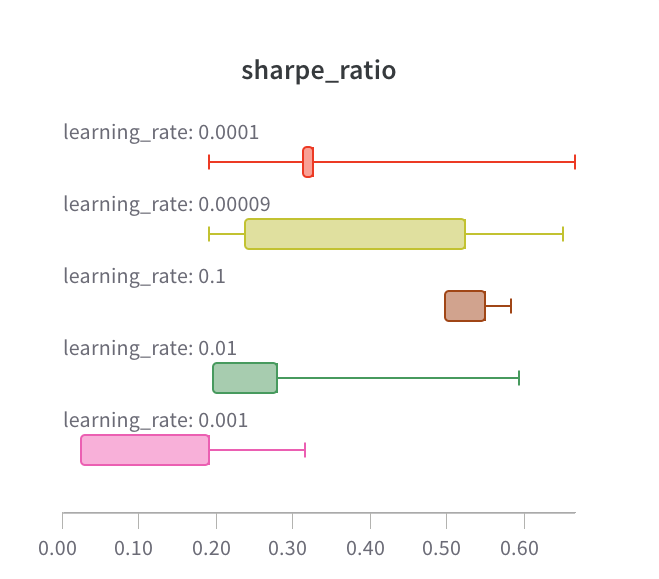 [See an example report](https://wandb.ai/wandb/plots/reports/Custom-Bar-Charts--VmlldzoyNzExNzk) or [try an example Google Colab notebook](https://tiny.cc/custom-charts).
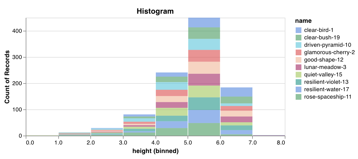 [See an example report](https://wandb.ai/wandb/plots/reports/Custom-Histograms--VmlldzoyNzE0NzM) or [try an example Google Colab notebook](https://tiny.cc/custom-charts).
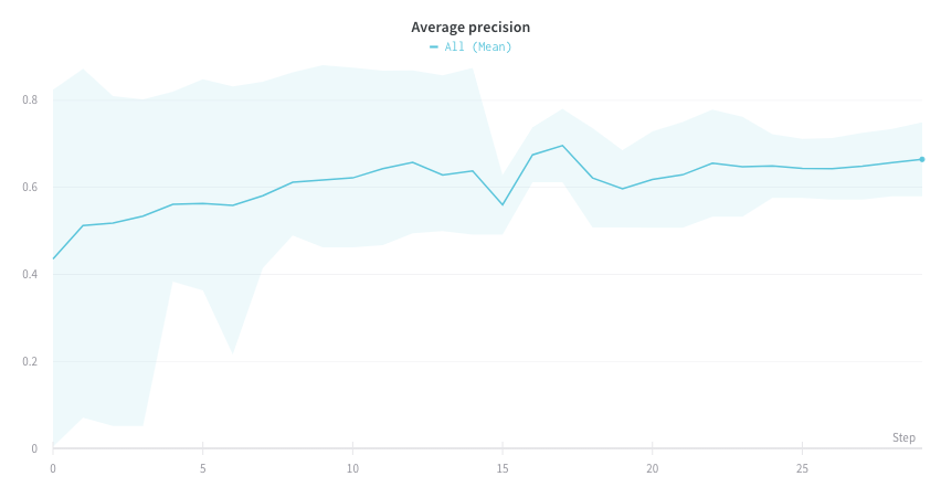 [See an example report](https://wandb.ai/wandb/plots/reports/Plot-Precision-Recall-Curves--VmlldzoyNjk1ODY) or [try an example Google Colab notebook](https://colab.research.google.com/drive/1mS8ogA3LcZWOXchfJoMrboW3opY1A8BY?usp=sharing).
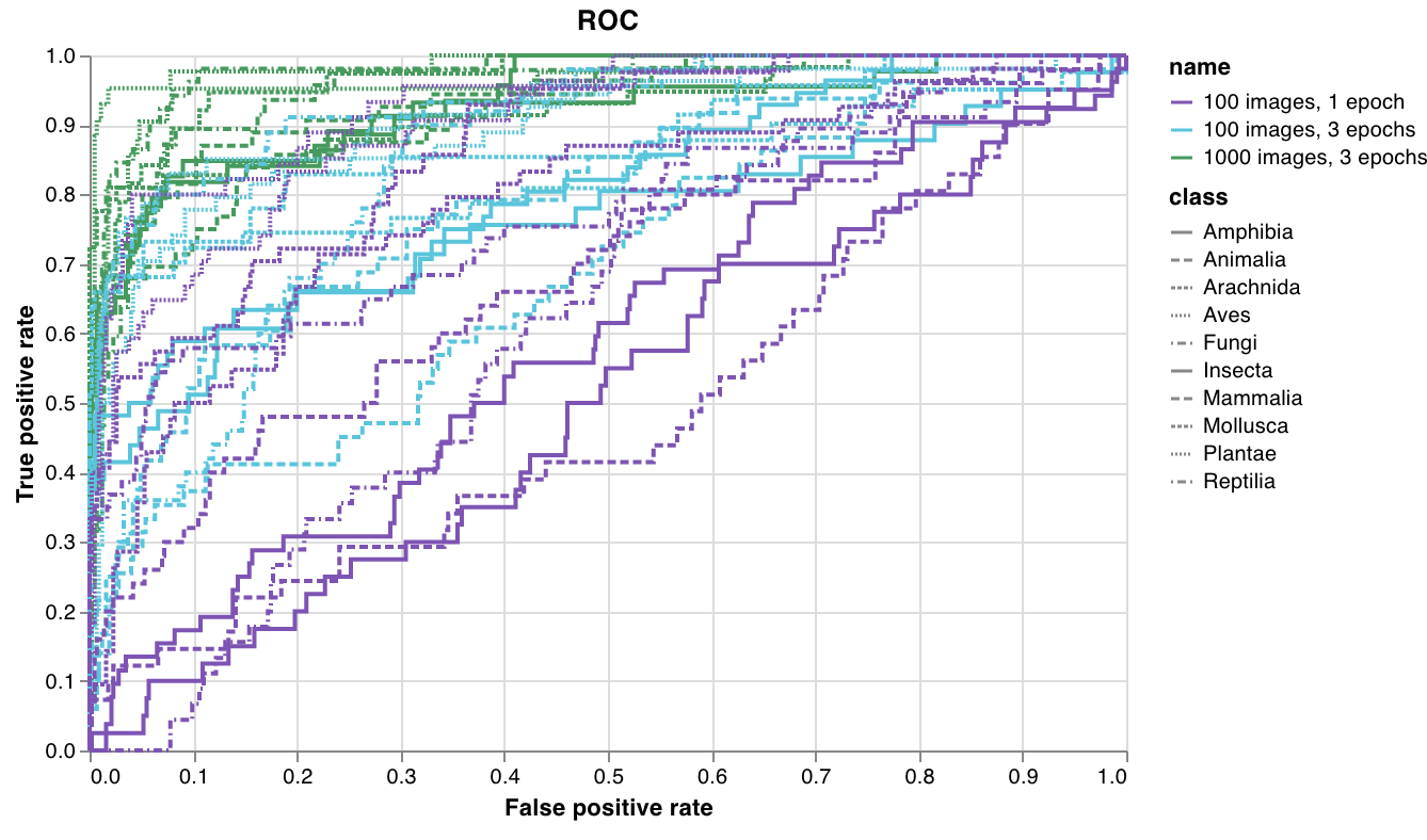 [See an example report](https://wandb.ai/wandb/plots/reports/Plot-ROC-Curves--VmlldzoyNjk3MDE) or [try an example Google Colab notebook](https://colab.research.google.com/drive/1_RMppCqsA8XInV_jhJz32NCZG6Z5t1RO?usp=sharing).
 ## Log data
Before you can visualize anything in a custom chart, your script must log the underlying data in a format the chart editor can query. You can log the following data types from your script and use them in a custom chart:
* **Config**: Initial settings of your experiment (your independent variables). This includes any named fields you've logged as keys to `wandb.Run.config` at the start of your training. For example, `wandb.Run.config.learning_rate = 0.0001`.
* **Summary**: Single values logged during training (your results or dependent variables). For example, `wandb.Run.log({"val_acc" : 0.8})`. If you write to this key multiple times during training through `wandb.Run.log()`, the summary is set to the final value of that key.
* **History**: The full time series of the logged scalar is available to the query through the `history` field.
* **summaryTable**: If you need to log a list of multiple values, use a `wandb.Table()` to save that data, then query it in your custom panel.
* **historyTable**: If you need to see the history data, then query `historyTable` in your custom chart panel. Each time you call `wandb.Table()` or log a custom chart, you're creating a new table in history for that step.
### Log a custom table
Use `wandb.Table()` to log your data as a 2D array. Typically, each row of this table represents one data point, and each column denotes the relevant fields or dimensions for each data point that you want to plot. As you configure a custom panel, the whole table is accessible through the named key passed to `wandb.Run.log()` (`custom_data_table` in the following example). The individual fields are accessible through the column names (`x`, `y`, and `z`). You can log tables at multiple time steps throughout your experiment. The maximum size of each table is 10,000 rows. [Try an example Google Colab notebook](https://tiny.cc/custom-charts).
```python theme={null}
with wandb.init() as run:
# Logging a custom table of data
my_custom_data = [[x1, y1, z1], [x2, y2, z2]]
run.log(
{"custom_data_table": wandb.Table(data=my_custom_data, columns=["x", "y", "z"])}
)
```
## Customize the chart
After you log data, build a chart in the W\&B app by choosing which logged values to pull in and how to render them. Add a new custom chart to get started, then edit the query to select data from your visible runs. The query uses [GraphQL](https://graphql.org) to fetch data from the config, summary, and history fields in your runs.
You can also ask ARIA to create a custom chart from a description. Open ARIA from your project workspace and describe the chart you want:
## Log data
Before you can visualize anything in a custom chart, your script must log the underlying data in a format the chart editor can query. You can log the following data types from your script and use them in a custom chart:
* **Config**: Initial settings of your experiment (your independent variables). This includes any named fields you've logged as keys to `wandb.Run.config` at the start of your training. For example, `wandb.Run.config.learning_rate = 0.0001`.
* **Summary**: Single values logged during training (your results or dependent variables). For example, `wandb.Run.log({"val_acc" : 0.8})`. If you write to this key multiple times during training through `wandb.Run.log()`, the summary is set to the final value of that key.
* **History**: The full time series of the logged scalar is available to the query through the `history` field.
* **summaryTable**: If you need to log a list of multiple values, use a `wandb.Table()` to save that data, then query it in your custom panel.
* **historyTable**: If you need to see the history data, then query `historyTable` in your custom chart panel. Each time you call `wandb.Table()` or log a custom chart, you're creating a new table in history for that step.
### Log a custom table
Use `wandb.Table()` to log your data as a 2D array. Typically, each row of this table represents one data point, and each column denotes the relevant fields or dimensions for each data point that you want to plot. As you configure a custom panel, the whole table is accessible through the named key passed to `wandb.Run.log()` (`custom_data_table` in the following example). The individual fields are accessible through the column names (`x`, `y`, and `z`). You can log tables at multiple time steps throughout your experiment. The maximum size of each table is 10,000 rows. [Try an example Google Colab notebook](https://tiny.cc/custom-charts).
```python theme={null}
with wandb.init() as run:
# Logging a custom table of data
my_custom_data = [[x1, y1, z1], [x2, y2, z2]]
run.log(
{"custom_data_table": wandb.Table(data=my_custom_data, columns=["x", "y", "z"])}
)
```
## Customize the chart
After you log data, build a chart in the W\&B app by choosing which logged values to pull in and how to render them. Add a new custom chart to get started, then edit the query to select data from your visible runs. The query uses [GraphQL](https://graphql.org) to fetch data from the config, summary, and history fields in your runs.
You can also ask ARIA to create a custom chart from a description. Open ARIA from your project workspace and describe the chart you want:
 ### Custom visualizations
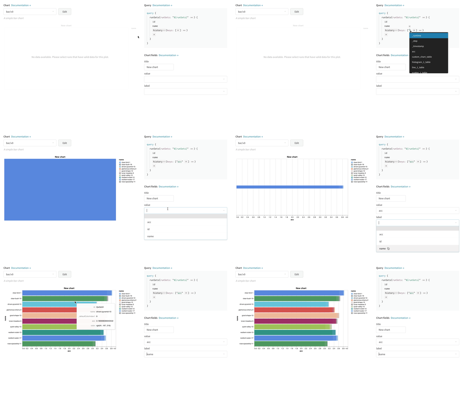
Select a **Chart** in the upper right corner to start with a default preset. Next, select **Chart fields** to map the data you're pulling in from the query to the corresponding fields in your chart.
The following image shows how to select a metric and then map it into the bar chart fields.
### Custom visualizations
Select a **Chart** in the upper right corner to start with a default preset. Next, select **Chart fields** to map the data you're pulling in from the query to the corresponding fields in your chart.
The following image shows how to select a metric and then map it into the bar chart fields.
 ### Edit Vega
Click **Edit** at the top of the panel to go into [Vega](https://vega.github.io/vega/) edit mode. Here you can define a [Vega specification](https://vega.github.io/vega/docs/specification/) that creates an interactive chart in the UI. You can change any aspect of the chart. For example, you can change the title, pick a different color scheme, or show curves as a series of points instead of as connected lines. You can also make changes to the data itself, such as using a Vega transform to bin an array of values into a histogram. The panel preview updates interactively, so you can see the effect of your changes as you edit the Vega spec or query. For more information, see the [Vega documentation and tutorials](https://vega.github.io/vega/).
**Field references**
To pull data into your chart from W\&B, add template strings of the form `"${field:
### Edit Vega
Click **Edit** at the top of the panel to go into [Vega](https://vega.github.io/vega/) edit mode. Here you can define a [Vega specification](https://vega.github.io/vega/docs/specification/) that creates an interactive chart in the UI. You can change any aspect of the chart. For example, you can change the title, pick a different color scheme, or show curves as a series of points instead of as connected lines. You can also make changes to the data itself, such as using a Vega transform to bin an array of values into a histogram. The panel preview updates interactively, so you can see the effect of your changes as you edit the Vega spec or query. For more information, see the [Vega documentation and tutorials](https://vega.github.io/vega/).
**Field references**
To pull data into your chart from W\&B, add template strings of the form `"${field: