> ## Documentation Index
> Fetch the complete documentation index at: https://docs.wandb.ai/llms.txt
> Use this file to discover all available pages before exploring further.
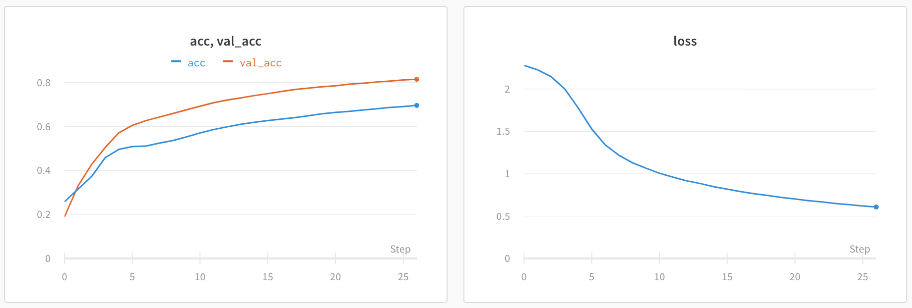
> Visualize metrics, customize axes, and compare multiple lines on a plot
# Line plots overview
Line plots display by default for metrics logged with `wandb.Run.log()` over time. Line plots support plotting multiple metrics, calculating custom axes, and more.
This page shows how to create, configure, and manage line plots in a [workspace](/models/track/workspaces).
 For [runs](/models/runs) that execute on [CoreWeave Kubernetes Service (CKS)](https://docs.coreweave.com/products/cks) clusters, [CoreWeave Mission Control](https://www.coreweave.com/mission-control) can monitor your compute infrastructure when the integration is enabled. If an error occurs, W\&B populates infrastructure information onto your run's plots in your project's workspace. For prerequisites and details, see [Visualize CoreWeave infrastructure alerts](/models/runs/infrastructure-alerts).
## Add a line plot
The following sections describe how to create a line plot for a single metric or multiple metrics.
In an [automatic workspace](/models/app/features/panels#workspace-modes), W\&B creates a single-metric line plot automatically for each logged metric. Follow these steps to re-add a line plot that was deleted from an automatic workspace, or to add a line plot to a manual workspace.
1. Navigate to your workspace.
2. To add a line plot globally, click **Add panels** in the control bar near the panel search field.
To add a line plot directly to a section instead, click the section's **action ()** menu, then click **+ Add panels**.
3. To add a single-metric plot with default settings, click **Quick panel builder**.
1. In the **Single-key panels** tab, hover over a metric, then click **Add**. Repeat this step for each panel you want to add.
2. Click **Create \[NUMBER] panels**.
4. To add a custom line plot instead, click **Line plot**.
1. Configure the line plot's data, grouping, and display preferences using the corresponding tabs. For details, see [Edit line plot settings](#edit-line-plot-settings).
2. To add calculated expressions to the x-axis or y-axis, click **Expressions**. [JavaScript regular expressions](https://www.w3schools.com/js/js_regexp.asp) are supported.
5. Select the type of panel to add, such as a chart. The panel's configuration details appear with selected defaults.
6. Optionally, customize the panel and its display preferences. Configuration options depend on the type of panel you select. For more information about the options for each type of panel, see [Line plots](/models/app/features/panels/line-plot/) or [Bar plots](/models/app/features/panels/bar-plot/).
7. Click **Apply**.
This feature is in preview, available by invitation only. To request enrollment, contact [support](mailto:support@wandb.com) or your AISE.
In an [automatic workspace](/models/app/features/panels#workspace-modes), W\&B creates a single-metric line plot automatically for each logged metric. This section shows how to create a single line plot that shows multiple metrics together, defined by a JavaScript regular expression. You can optionally consolidate many single-metric plots into a single multi-metric plot. This can improve the performance of a workspace with many logged metrics, and can help you analyze the results of your runs.
1. Navigate to your workspace.
2. To add a line plot globally, click **Add panels** in the control bar near the panel search field.
To add a line plot directly to a section instead, click the section's **action ()** menu, then click **+ Add panels**.
3. Click **Quick panel builder**, then click the **Multi-metric panels** tab.
4. In **Regex** enter an expression in [JavaScript regular expression](https://www.w3schools.com/js/js_regexp.asp) format. As you type, the UI updates to show which metrics match the expression. By default, the plot name shows the regular expression used by the plot. The plot includes lines for all metrics that match the expression, including metrics logged in the future.
5. To optionally remove duplicate single-metric panels when the multi-metric plot is created, toggle **Clean up auto-generated panels**. A preview shows which panels are cleaned up. When this option is turned on, W\&B doesn't create a single-metric plot for a newly logged metric that matches the expression. Instead, it appears only in this multi-metric plot.
6. Click **Create \[NUMBER] panels**.
### Multi-metric regular expressions
Multi-metric line plots use [JavaScript regular expressions](https://developer.mozilla.org/en-US/docs/Web/JavaScript/Guide/Regular_expressions) to match metric names. The following sections describe common use cases and provide more details about how the regular expressions work, such as how capture groups affect the panels that W\&B creates.
#### Common use cases
The following examples show some ways you can use multi-metric panels to help you analyze your experiment results.
**Compare metrics across layers or model components**
Instead of creating separate panels for each layer's metrics, you can view them together in a single panel. For example, if you log metrics with consistent naming, like `layer_0_loss`, `layer_1_loss`, and `layer_2_loss` in this Python example code, you can use the regex `layer_\d+_loss` to display all layer losses on one plot.
```python theme={null}
with wandb.init(project="multi-layer-model") as run:
for step in range(100):
run.log({
"layer_0_loss": loss_0,
"layer_1_loss": loss_1,
"layer_2_loss": loss_2,
"step": step
})
```
**Group related metrics by prefix or suffix**
Match all metrics that share a common naming pattern. For example:
* `train_.*` matches all training metrics like `train_loss`, `train_accuracy`, `train_f1_score`.
* `.*_accuracy` matches accuracy metrics across different datasets like `train_accuracy`, `val_accuracy`, `test_accuracy`.
**Match specific metric variations**
Use alternation to match only the metrics you want. For example, the non-capture group `(?:layer_0|layer_10)_loss` matches only the first and tenth layer losses, excluding intermediate layers.
#### Capture groups
Capture groups in your regular expression control how multi-metric panels are created. This behavior can be confusing if you're not expecting it.
* **Capture groups create multiple panels**
When your regular expression includes parentheses that form a capture group, the UI creates a separate panel for each unique value captured by that group.
For example, the expression `(layer_0|layer_10)_loss` includes a capture group and creates two separate panels:
1. One panel for metrics matching `layer_0`.
2. One panel for metrics matching `layer_10`.
* **Non-capturing groups keep metrics together**
To match multiple alternatives without creating separate panels, use a non-capturing group with the `?:` syntax. The expression `(?:layer_0|layer_10)_loss` matches the same metrics as the previous example, but displays them together in a single panel.
Here's the difference:
* `(layer_0|layer_10)_loss` - Creates two panels, one for each layer.
* `(?:layer_0|layer_10)_loss` - Creates one panel showing both layers together.
This gives you flexibility to choose the approach that best fits your analysis needs. Use capture groups when you want to separate metrics into distinct panels. Use non-capturing groups when you want to compare metrics together on a single plot.
## Edit line plot settings
The following sections describe how to edit the settings for an individual line plot panel, all line plot panels in a section, or all line plot panels in a workspace. For details about line plot settings, see [Line plot reference](/models/app/features/panels/line-plot/reference).
### Individual line plot
A line plot's individual settings override the line plot settings for the section or the workspace. To customize a line plot:
1. Navigate to your workspace.
2. Hover your mouse over the panel, then click the gear icon.
3. Within the drawer that appears, select a tab to edit its settings.
4. Click **Apply**.
Line plot settings are organized into tabs:
* **Data**: Configure x-axis, y-axis, sampling method, smoothing, outliers, and chart type.
* **Grouping**: Configure whether and how to group and aggregate runs in the plot.
* **Chart**: Specify titles for the panel and axes, and configure legend visibility and position.
* **Legend**: Customize the appearance and content of the panel's legend.
* **Expressions**: Add custom calculated expressions for the axes.
For detailed information about each setting, see the [Line plot reference](/models/app/features/panels/line-plot/reference).
### All line plots in a section
To customize the default settings for all line plots in a section, overriding workspace settings for line plots:
1. Navigate to your workspace.
2. Click the section's gear icon to open its settings.
3. Within the drawer that appears, select the **Data** or **Display preferences** tabs to configure the default settings for the section. For details about each **Data** setting, see the [Line plot reference](/models/app/features/panels/line-plot/reference). For details about each display preference, see [Configure section layout](../#configure-section-layout).
### All line plots in a workspace
To customize the default settings for all line plots in a workspace:
1. Navigate to your workspace.
2. Click the workspace settings icon, which has a gear with the label **Settings**.
3. Click **Line plots**.
4. Within the drawer that appears, select the **Data** or **Display preferences** tabs to configure the default settings for the workspace.
* For details about each **Data** setting, see the [Line plot reference](/models/app/features/panels/line-plot/reference).
* For details about each **Display preferences** section, see [Workspace display preferences](../#configure-workspace-layout). At the workspace level, you can configure the default **Zooming** behavior for line plots. This setting controls whether to sync zooming across line plots with a matching x-axis key. Deactivated by default.
## Visualize average values on a plot
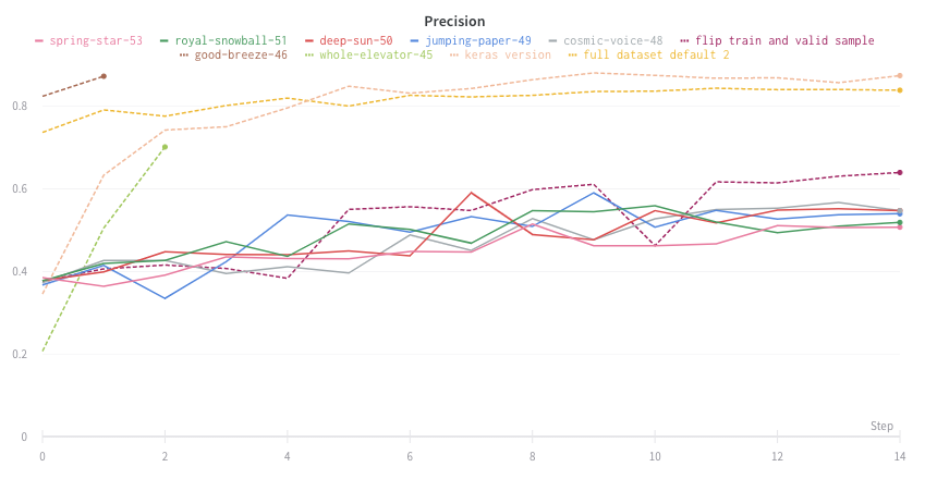
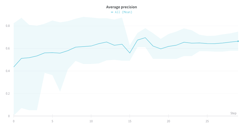
If you have several different experiments and you want to see the average of their values on a plot, you can use the Grouping feature in the table. Click **Group** above the run table and select **All** to show averaged values in your graphs.
The following image shows the graph before averaging, with one line per run:
For [runs](/models/runs) that execute on [CoreWeave Kubernetes Service (CKS)](https://docs.coreweave.com/products/cks) clusters, [CoreWeave Mission Control](https://www.coreweave.com/mission-control) can monitor your compute infrastructure when the integration is enabled. If an error occurs, W\&B populates infrastructure information onto your run's plots in your project's workspace. For prerequisites and details, see [Visualize CoreWeave infrastructure alerts](/models/runs/infrastructure-alerts).
## Add a line plot
The following sections describe how to create a line plot for a single metric or multiple metrics.
In an [automatic workspace](/models/app/features/panels#workspace-modes), W\&B creates a single-metric line plot automatically for each logged metric. Follow these steps to re-add a line plot that was deleted from an automatic workspace, or to add a line plot to a manual workspace.
1. Navigate to your workspace.
2. To add a line plot globally, click **Add panels** in the control bar near the panel search field.
To add a line plot directly to a section instead, click the section's **action ()** menu, then click **+ Add panels**.
3. To add a single-metric plot with default settings, click **Quick panel builder**.
1. In the **Single-key panels** tab, hover over a metric, then click **Add**. Repeat this step for each panel you want to add.
2. Click **Create \[NUMBER] panels**.
4. To add a custom line plot instead, click **Line plot**.
1. Configure the line plot's data, grouping, and display preferences using the corresponding tabs. For details, see [Edit line plot settings](#edit-line-plot-settings).
2. To add calculated expressions to the x-axis or y-axis, click **Expressions**. [JavaScript regular expressions](https://www.w3schools.com/js/js_regexp.asp) are supported.
5. Select the type of panel to add, such as a chart. The panel's configuration details appear with selected defaults.
6. Optionally, customize the panel and its display preferences. Configuration options depend on the type of panel you select. For more information about the options for each type of panel, see [Line plots](/models/app/features/panels/line-plot/) or [Bar plots](/models/app/features/panels/bar-plot/).
7. Click **Apply**.
This feature is in preview, available by invitation only. To request enrollment, contact [support](mailto:support@wandb.com) or your AISE.
In an [automatic workspace](/models/app/features/panels#workspace-modes), W\&B creates a single-metric line plot automatically for each logged metric. This section shows how to create a single line plot that shows multiple metrics together, defined by a JavaScript regular expression. You can optionally consolidate many single-metric plots into a single multi-metric plot. This can improve the performance of a workspace with many logged metrics, and can help you analyze the results of your runs.
1. Navigate to your workspace.
2. To add a line plot globally, click **Add panels** in the control bar near the panel search field.
To add a line plot directly to a section instead, click the section's **action ()** menu, then click **+ Add panels**.
3. Click **Quick panel builder**, then click the **Multi-metric panels** tab.
4. In **Regex** enter an expression in [JavaScript regular expression](https://www.w3schools.com/js/js_regexp.asp) format. As you type, the UI updates to show which metrics match the expression. By default, the plot name shows the regular expression used by the plot. The plot includes lines for all metrics that match the expression, including metrics logged in the future.
5. To optionally remove duplicate single-metric panels when the multi-metric plot is created, toggle **Clean up auto-generated panels**. A preview shows which panels are cleaned up. When this option is turned on, W\&B doesn't create a single-metric plot for a newly logged metric that matches the expression. Instead, it appears only in this multi-metric plot.
6. Click **Create \[NUMBER] panels**.
### Multi-metric regular expressions
Multi-metric line plots use [JavaScript regular expressions](https://developer.mozilla.org/en-US/docs/Web/JavaScript/Guide/Regular_expressions) to match metric names. The following sections describe common use cases and provide more details about how the regular expressions work, such as how capture groups affect the panels that W\&B creates.
#### Common use cases
The following examples show some ways you can use multi-metric panels to help you analyze your experiment results.
**Compare metrics across layers or model components**
Instead of creating separate panels for each layer's metrics, you can view them together in a single panel. For example, if you log metrics with consistent naming, like `layer_0_loss`, `layer_1_loss`, and `layer_2_loss` in this Python example code, you can use the regex `layer_\d+_loss` to display all layer losses on one plot.
```python theme={null}
with wandb.init(project="multi-layer-model") as run:
for step in range(100):
run.log({
"layer_0_loss": loss_0,
"layer_1_loss": loss_1,
"layer_2_loss": loss_2,
"step": step
})
```
**Group related metrics by prefix or suffix**
Match all metrics that share a common naming pattern. For example:
* `train_.*` matches all training metrics like `train_loss`, `train_accuracy`, `train_f1_score`.
* `.*_accuracy` matches accuracy metrics across different datasets like `train_accuracy`, `val_accuracy`, `test_accuracy`.
**Match specific metric variations**
Use alternation to match only the metrics you want. For example, the non-capture group `(?:layer_0|layer_10)_loss` matches only the first and tenth layer losses, excluding intermediate layers.
#### Capture groups
Capture groups in your regular expression control how multi-metric panels are created. This behavior can be confusing if you're not expecting it.
* **Capture groups create multiple panels**
When your regular expression includes parentheses that form a capture group, the UI creates a separate panel for each unique value captured by that group.
For example, the expression `(layer_0|layer_10)_loss` includes a capture group and creates two separate panels:
1. One panel for metrics matching `layer_0`.
2. One panel for metrics matching `layer_10`.
* **Non-capturing groups keep metrics together**
To match multiple alternatives without creating separate panels, use a non-capturing group with the `?:` syntax. The expression `(?:layer_0|layer_10)_loss` matches the same metrics as the previous example, but displays them together in a single panel.
Here's the difference:
* `(layer_0|layer_10)_loss` - Creates two panels, one for each layer.
* `(?:layer_0|layer_10)_loss` - Creates one panel showing both layers together.
This gives you flexibility to choose the approach that best fits your analysis needs. Use capture groups when you want to separate metrics into distinct panels. Use non-capturing groups when you want to compare metrics together on a single plot.
## Edit line plot settings
The following sections describe how to edit the settings for an individual line plot panel, all line plot panels in a section, or all line plot panels in a workspace. For details about line plot settings, see [Line plot reference](/models/app/features/panels/line-plot/reference).
### Individual line plot
A line plot's individual settings override the line plot settings for the section or the workspace. To customize a line plot:
1. Navigate to your workspace.
2. Hover your mouse over the panel, then click the gear icon.
3. Within the drawer that appears, select a tab to edit its settings.
4. Click **Apply**.
Line plot settings are organized into tabs:
* **Data**: Configure x-axis, y-axis, sampling method, smoothing, outliers, and chart type.
* **Grouping**: Configure whether and how to group and aggregate runs in the plot.
* **Chart**: Specify titles for the panel and axes, and configure legend visibility and position.
* **Legend**: Customize the appearance and content of the panel's legend.
* **Expressions**: Add custom calculated expressions for the axes.
For detailed information about each setting, see the [Line plot reference](/models/app/features/panels/line-plot/reference).
### All line plots in a section
To customize the default settings for all line plots in a section, overriding workspace settings for line plots:
1. Navigate to your workspace.
2. Click the section's gear icon to open its settings.
3. Within the drawer that appears, select the **Data** or **Display preferences** tabs to configure the default settings for the section. For details about each **Data** setting, see the [Line plot reference](/models/app/features/panels/line-plot/reference). For details about each display preference, see [Configure section layout](../#configure-section-layout).
### All line plots in a workspace
To customize the default settings for all line plots in a workspace:
1. Navigate to your workspace.
2. Click the workspace settings icon, which has a gear with the label **Settings**.
3. Click **Line plots**.
4. Within the drawer that appears, select the **Data** or **Display preferences** tabs to configure the default settings for the workspace.
* For details about each **Data** setting, see the [Line plot reference](/models/app/features/panels/line-plot/reference).
* For details about each **Display preferences** section, see [Workspace display preferences](../#configure-workspace-layout). At the workspace level, you can configure the default **Zooming** behavior for line plots. This setting controls whether to sync zooming across line plots with a matching x-axis key. Deactivated by default.
## Visualize average values on a plot
If you have several different experiments and you want to see the average of their values on a plot, you can use the Grouping feature in the table. Click **Group** above the run table and select **All** to show averaged values in your graphs.
The following image shows the graph before averaging, with one line per run:
 The following image shows a graph that represents average values across runs using grouped lines.
 ## Visualize NaN value on a plot
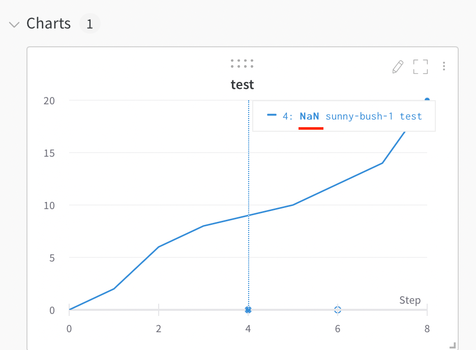
To track metrics that might sometimes be undefined, such as a loss that returns `NaN`, you can log them and W\&B renders them on the line plot. You can also plot `NaN` values including PyTorch tensors on a line plot with `wandb.Run.log()`. For example:
```python theme={null}
with wandb.init() as run:
# Log a NaN value
run.log({"test": float("nan")})
```
## Visualize NaN value on a plot
To track metrics that might sometimes be undefined, such as a loss that returns `NaN`, you can log them and W\&B renders them on the line plot. You can also plot `NaN` values including PyTorch tensors on a line plot with `wandb.Run.log()`. For example:
```python theme={null}
with wandb.init() as run:
# Log a NaN value
run.log({"test": float("nan")})
```
 ## Compare multiple metrics on one chart
To compare multiple metrics from one or more runs side by side, add a **Run comparer** panel to your workspace.
## Compare multiple metrics on one chart
To compare multiple metrics from one or more runs side by side, add a **Run comparer** panel to your workspace.
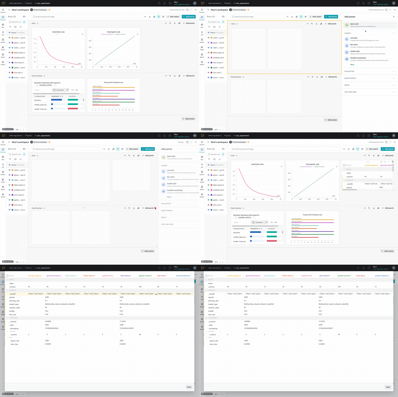 1. Navigate to your workspace.
2. Select the **Add panels** button in the top right corner of the page.
3. From the drawer that appears, expand the **Evaluation** dropdown.
4. Select **Run comparer**.
## Change the colors of the lines
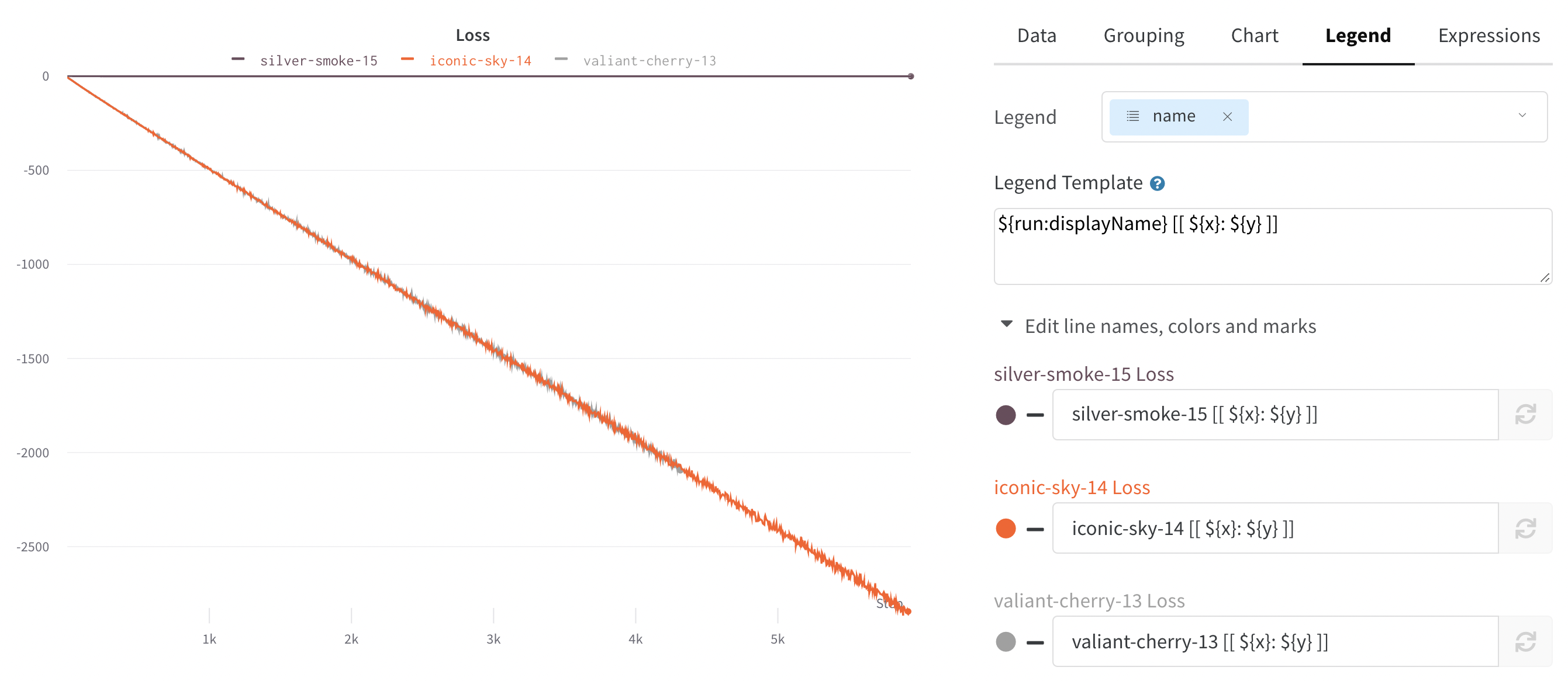
If the default color of runs isn't helpful for comparison, W\&B provides two ways to change the colors: from the run table or from a chart's legend settings.
Each run is given a random color by default upon initialization.
1. Navigate to your workspace.
2. Select the **Add panels** button in the top right corner of the page.
3. From the drawer that appears, expand the **Evaluation** dropdown.
4. Select **Run comparer**.
## Change the colors of the lines
If the default color of runs isn't helpful for comparison, W\&B provides two ways to change the colors: from the run table or from a chart's legend settings.
Each run is given a random color by default upon initialization.
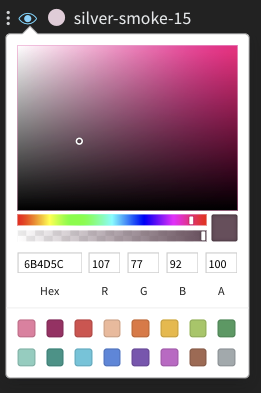
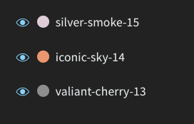 Upon clicking any of the colors, a color palette appears from which you can choose the color you want.
 1. Navigate to your workspace.
2. Hover your mouse over the panel whose settings you want to edit.
3. Select the pencil icon that appears.
4. Choose the **Legend** tab.
1. Navigate to your workspace.
2. Hover your mouse over the panel whose settings you want to edit.
3. Select the pencil icon that appears.
4. Choose the **Legend** tab.
 ## Visualize on different x axes
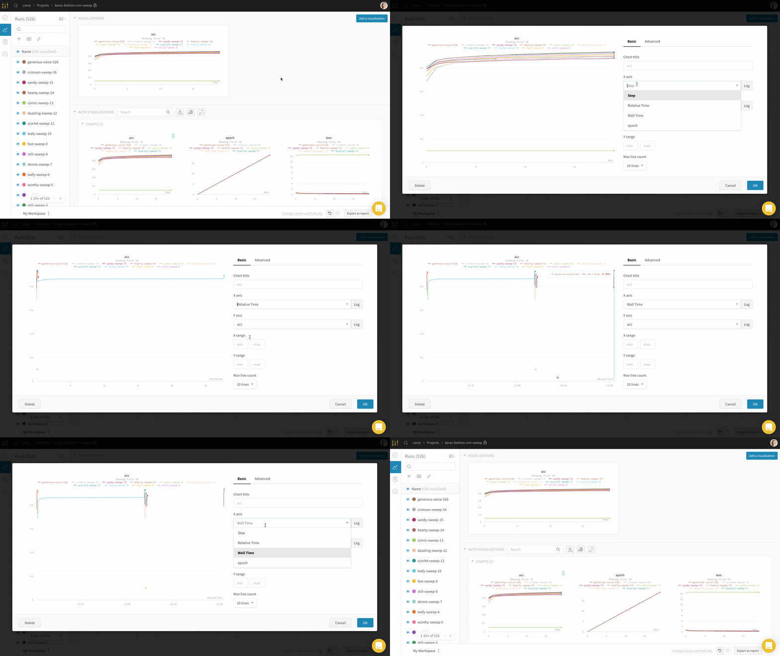
By default, line plots use training steps as the x-axis, but you can switch to a different x-axis to view your data from another perspective. If you want to see the absolute time that an experiment has taken, or see what day an experiment ran, you can switch the x-axis. The following example shows switching from steps to relative time and then to wall time.
## Visualize on different x axes
By default, line plots use training steps as the x-axis, but you can switch to a different x-axis to view your data from another perspective. If you want to see the absolute time that an experiment has taken, or see what day an experiment ran, you can switch the x-axis. The following example shows switching from steps to relative time and then to wall time.
 To use a custom x-axis, log the metric in the same call to `wandb.Run.log()` where you log the y-axis. For example:
```python theme={null}
with wandb.init() as run:
for i in range(100):
run.log({"accuracy": acc, "custom_x": i * 10})
```
For more details, see [Customize log axes](/models/track/log/customize-logging-axes#customize-log-axes).
## Zoom
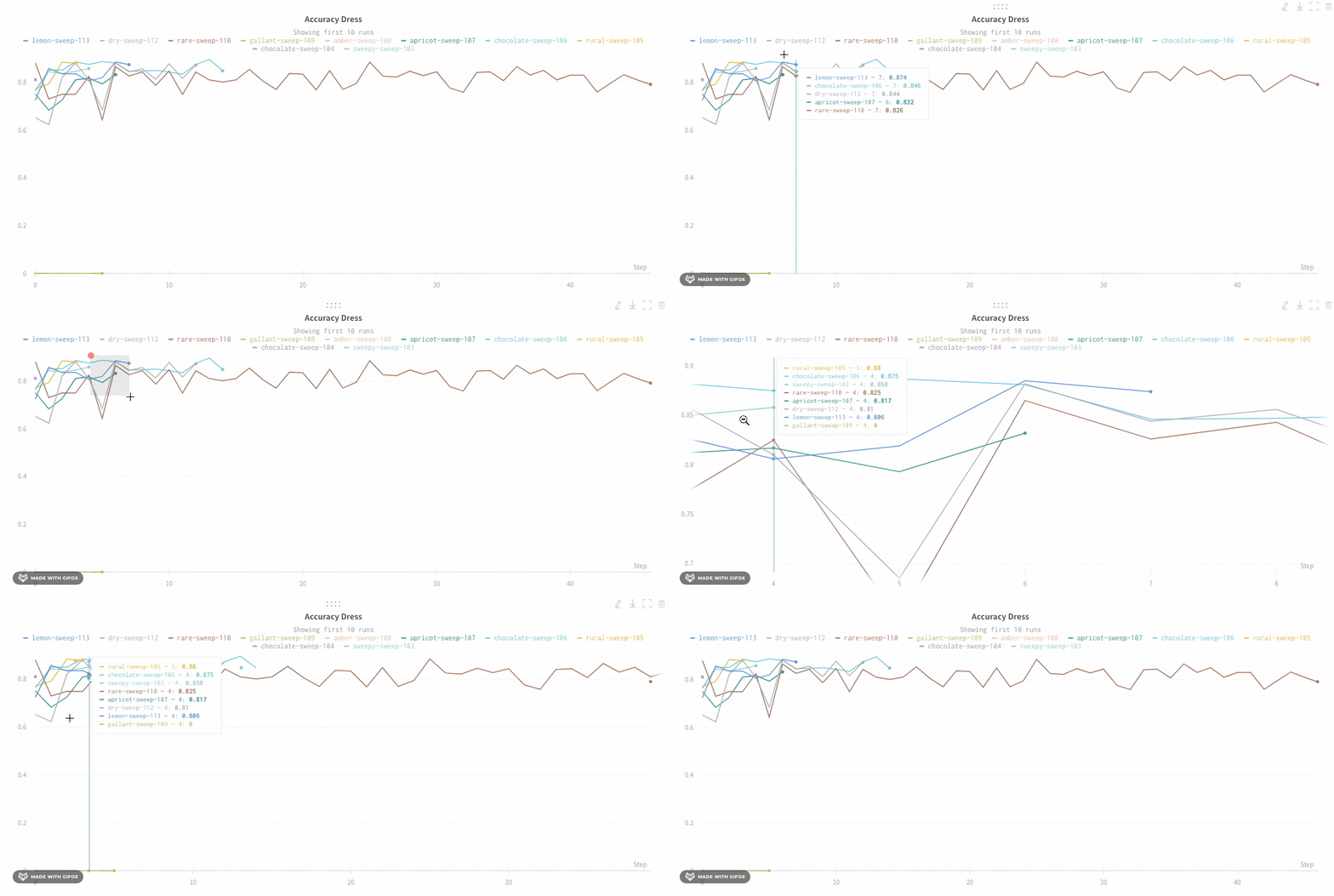
To inspect a specific region of a line plot more closely, you can zoom in on both axes at once. Click and drag a rectangle to zoom vertically and horizontally at the same time. This changes the x-axis and y-axis zoom.
To use a custom x-axis, log the metric in the same call to `wandb.Run.log()` where you log the y-axis. For example:
```python theme={null}
with wandb.init() as run:
for i in range(100):
run.log({"accuracy": acc, "custom_x": i * 10})
```
For more details, see [Customize log axes](/models/track/log/customize-logging-axes#customize-log-axes).
## Zoom
To inspect a specific region of a line plot more closely, you can zoom in on both axes at once. Click and drag a rectangle to zoom vertically and horizontally at the same time. This changes the x-axis and y-axis zoom.
 ## Hide chart legend
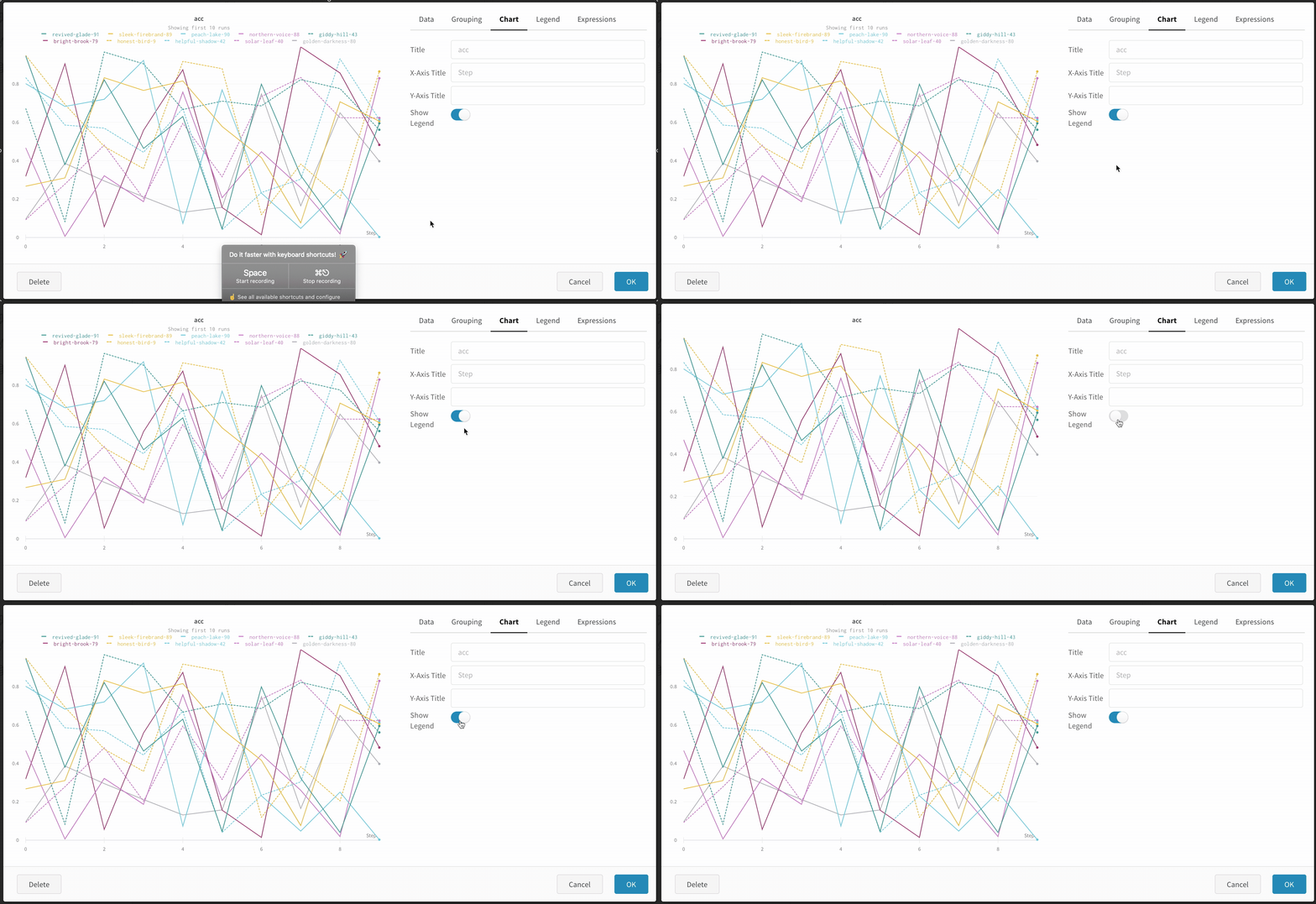
If the chart legend is taking up space you want to use for the plot, you can turn it off. Turn off the legend in the line plot with this toggle:
## Hide chart legend
If the chart legend is taking up space you want to use for the plot, you can turn it off. Turn off the legend in the line plot with this toggle:
 ## Create a run metrics notification
Use [Automations](/models/automations/) to notify your team when a run metric meets a condition you specify. An automation can post to a Slack channel or run a webhook.
From a line plot, you can create a [run metrics notification](/models/automations/automation-events/#run-events) for the metric it shows:
1. Navigate to your workspace.
2. Hover over the panel, then click the bell icon.
3. Configure the automation using the basic or advanced configuration controls. For example, apply a run filter to limit the scope of the automation, or configure an absolute threshold.
Learn more about [Automations](/models/automations/).
## Create a run metrics notification
Use [Automations](/models/automations/) to notify your team when a run metric meets a condition you specify. An automation can post to a Slack channel or run a webhook.
From a line plot, you can create a [run metrics notification](/models/automations/automation-events/#run-events) for the metric it shows:
1. Navigate to your workspace.
2. Hover over the panel, then click the bell icon.
3. Configure the automation using the basic or advanced configuration controls. For example, apply a run filter to limit the scope of the automation, or configure an absolute threshold.
Learn more about [Automations](/models/automations/).