This is the multi-page printable view of this section. Click here to print.

Return to the regular view of this page.

Line plots

Visualize metrics, customize axes, and compare multiple lines on a plot

Line plots show up by default when you plot metrics over time with wandb.log(). Customize with chart settings to compare multiple lines on the same plot, calculate custom axes, and rename labels.

Edit line panel settings

Hover your mouse over the panel you want to edit its settings for. Select the pencil icon that appears. Within the modal that appears, select a tab to edit the Data, Grouping, Chart, Expressions, or Legend settings.

Data

Select the Data tab to edit the x-axis, y-axis, smoothing filter, point aggregation and more. The proceeding describes some of the options you can edit:

  • X axis: By default the x-axis is set to Step. You can change the x-axis to Relative Time, or select a custom axis based on values you log with W&B.
    • Relative Time (Wall) is clock time since the process started, so if you started a run and resumed it a day later and logged something that would be plotted a 24hrs.
    • Relative Time (Process) is time inside the running process, so if you started a run and ran for 10 seconds and resumed a day later that point would be plotted at 10s
    • Wall Time is minutes elapsed since the start of the first run on the graph
    • Step increments by default each time wandb.log() is called, and is supposed to reflect the number of training steps you’ve logged from your model
  • Y axes: Select y-axes from the logged values, including metrics and hyperparameters that change over time.
  • Min, max, and log scale: Minimum, maximum, and log scale settings for x axis and y axis in line plots
  • Smoothing: Change the smoothing on the line plot.
  • Outliers: Rescale to exclude outliers from the default plot min and max scale
  • Max runs to show: Show more lines on the line plot at once by increasing this number, which defaults to 10 runs. You’ll see the message “Showing first 10 runs” on the top of the chart if there are more than 10 runs available but the chart is constraining the number visible.
  • Chart type: Change between a line plot, an area plot, and a percentage area plot

Grouping

Select the Grouping tab to use group by methods to organize your data.

  • Group by: Select a column, and all the runs with the same value in that column will be grouped together.
  • Agg: Aggregation— the value of the line on the graph. The options are mean, median, min, and max of the group.

Chart

Select the Chart tab to edit the plot’s title, axis titles, legend, and more.

  • Title: Add a custom title for line plot, which shows up at the top of the chart
  • X-Axis title: Add a custom title for the x-axis of the line plot, which shows up in the lower right corner of the chart.
  • Y-Axis title: Add a custom title for the y-axis of the line plot, which shows up in the upper left corner of the chart.
  • Show legend: Toggle legend on or off
  • Font size: Change the font size of the chart title, x-axis title, and y-axis title
  • Legend position: Change the position of the legend on the chart

Legend

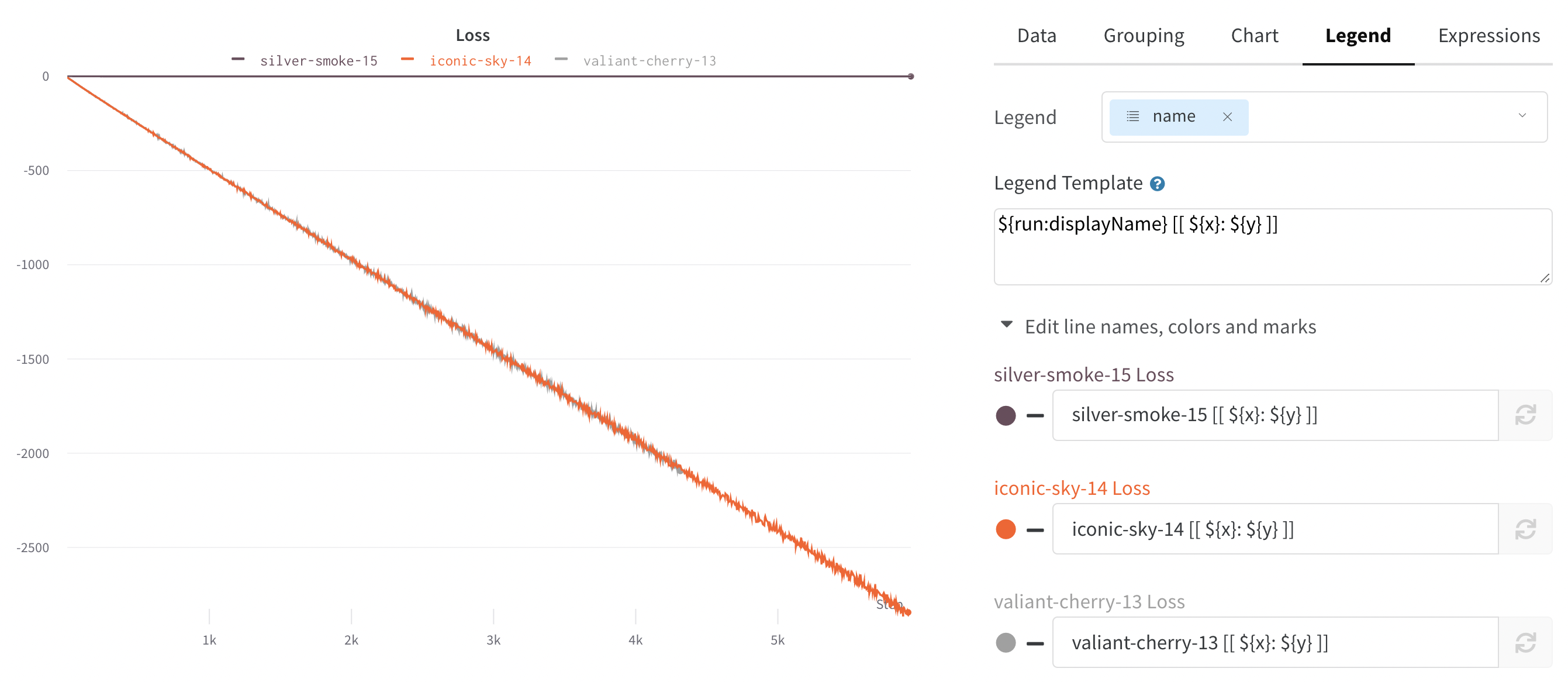
  • Legend: Select field that you want to see in the legend of the plot for each line. You could, for example, show the name of the run and the learning rate.
  • Legend template: Fully customizable, this powerful template allows you to specify exactly what text and variables you want to show up in the template at the top of the line plot as well as the legend that appears when you hover your mouse over the plot.

Expressions

  • Y Axis Expressions: Add calculated metrics to your graph. You can use any of the logged metrics as well as configuration values like hyperparameters to calculate custom lines.
  • X Axis Expressions: Rescale the x-axis to use calculated values using custom expressions. Useful variables include**_step** for the default x-axis, and the syntax for referencing summary values is ${summary:value}

Visualize average values on a plot

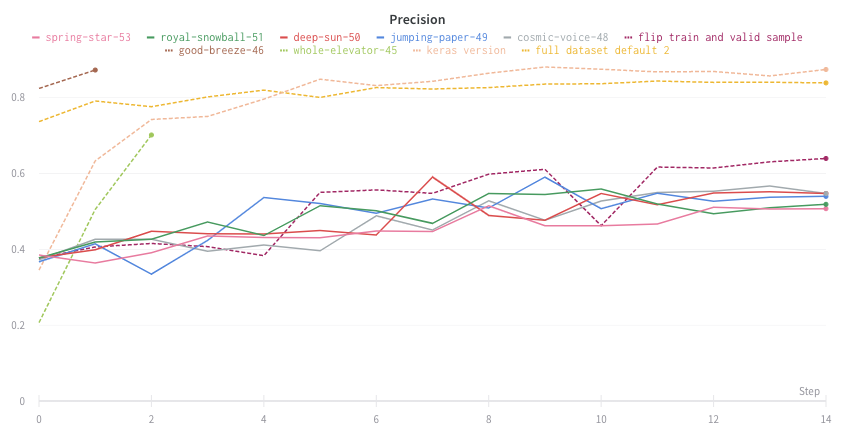
If you have several different experiments and you’d like to see the average of their values on a plot, you can use the Grouping feature in the table. Click “Group” above the run table and select “All” to show averaged values in your graphs.

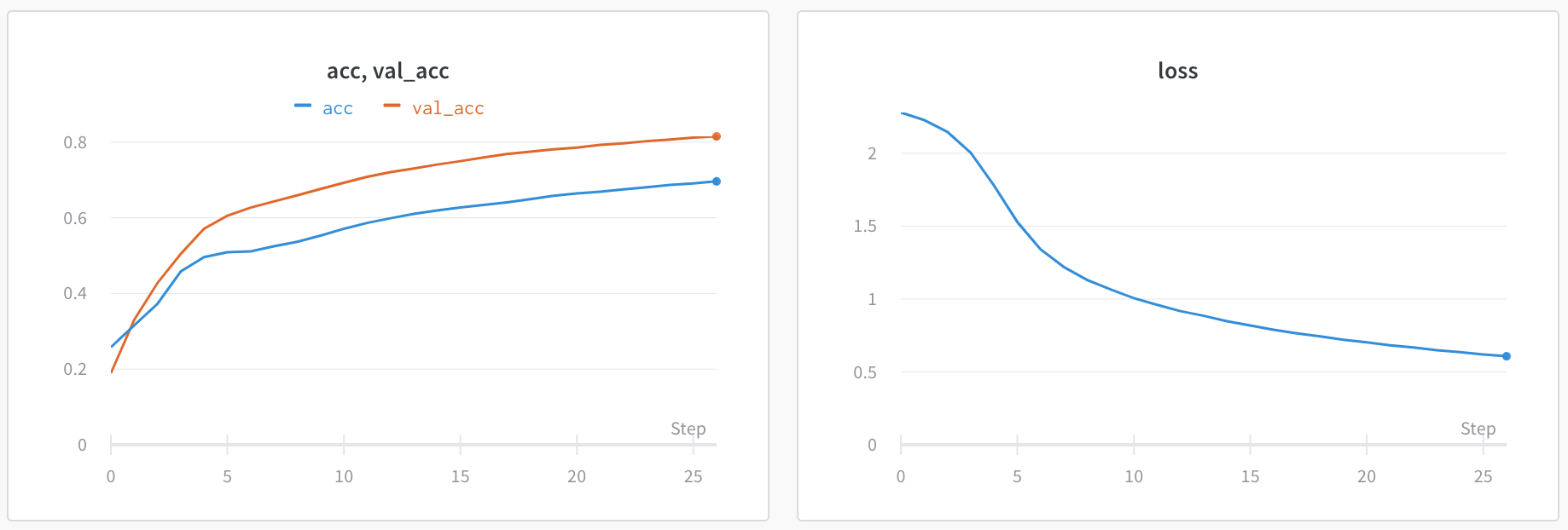
Here is what the graph looks like before averaging:
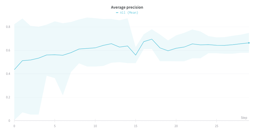
The proceeding image shows a graph that represents average values across runs using grouped lines.

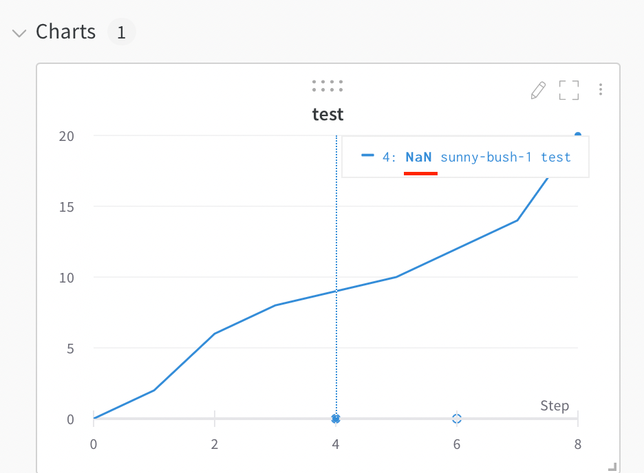
Visualize NaN value on a plot

You can also plot NaN values including PyTorch tensors on a line plot with wandb.log. For example:

wandb.log({"test": [..., float("nan"), ...]})

Compare two metrics on one chart

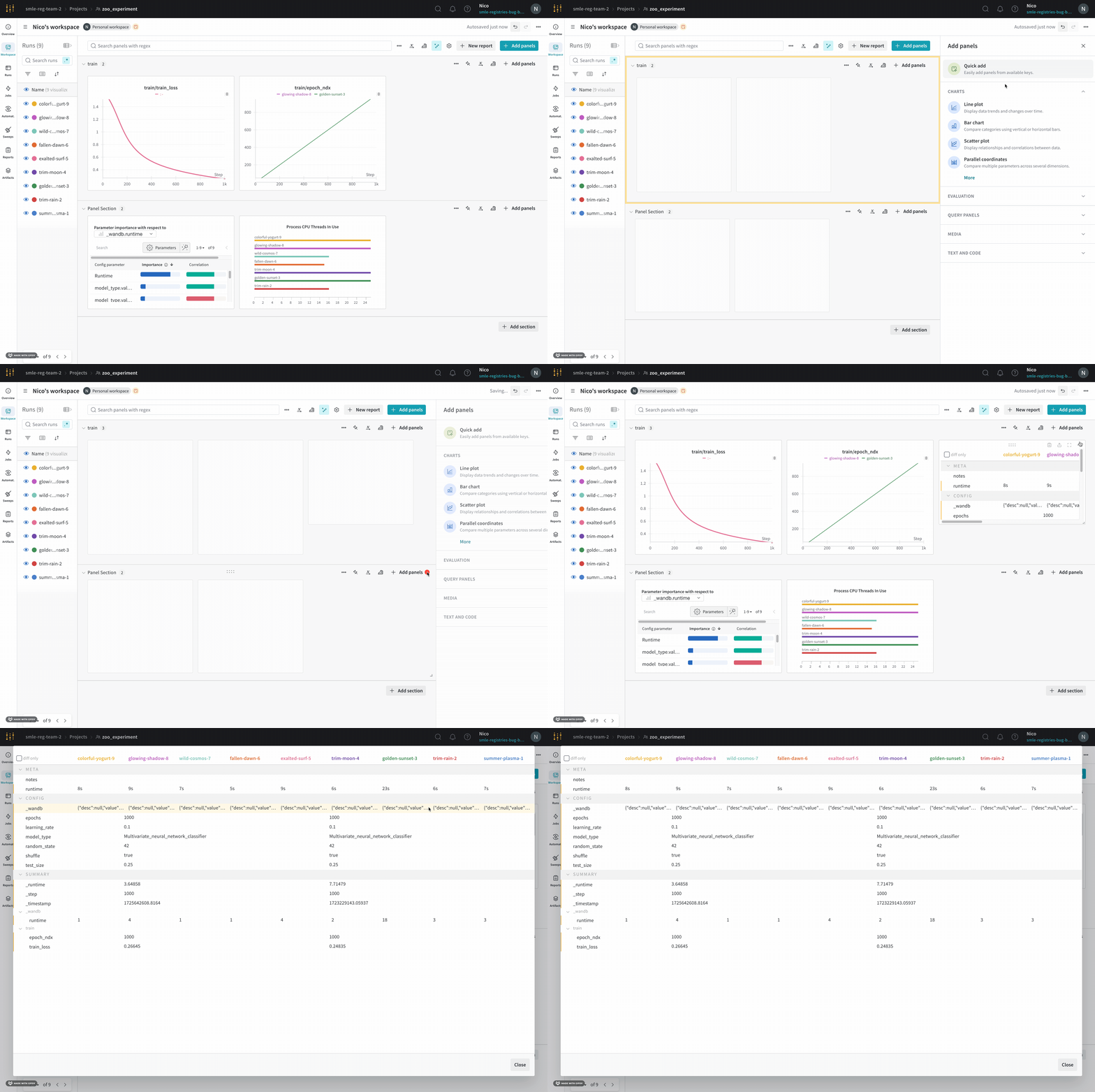
  1. Select the Add panels button in the top right corner of the page.
  2. From the left panel that appears, expand the Evaluation dropdown.
  3. Select Run comparer

Change the color of the line plots

Sometimes the default color of runs is not helpful for comparison. To help overcome this, wandb provides two instances with which one can manually change the colors.

Each run is given a random color by default upon initialization.
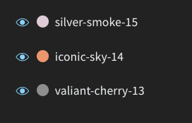
Random colors given to runs

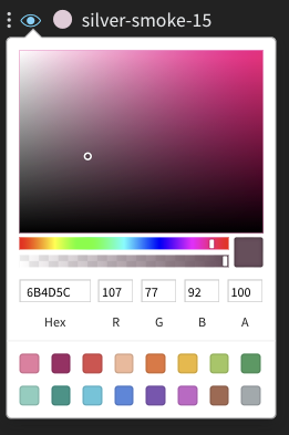
Upon clicking any of the colors, a color palette appears from which we can manually choose the color we want.

The color palette
  1. Hover your mouse over the panel you want to edit its settings for.
  2. Select the pencil icon that appears.
  3. Choose the Legend tab.

Visualize on different x axes

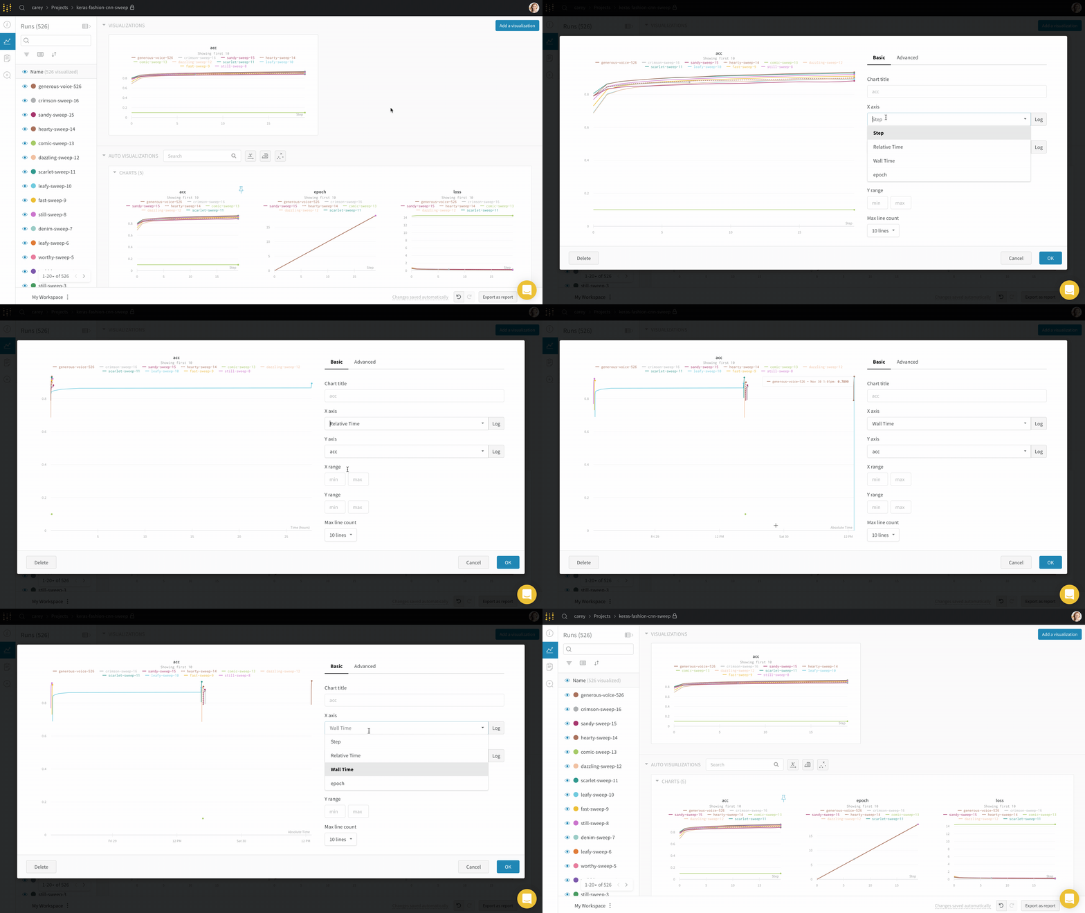
If you’d like to see the absolute time that an experiment has taken, or see what day an experiment ran, you can switch the x axis. Here’s an example of switching from steps to relative time and then to wall time.
Area plots

In the line plot settings, in the advanced tab, click on different plot styles to get an area plot or a percentage area plot.

Zoom

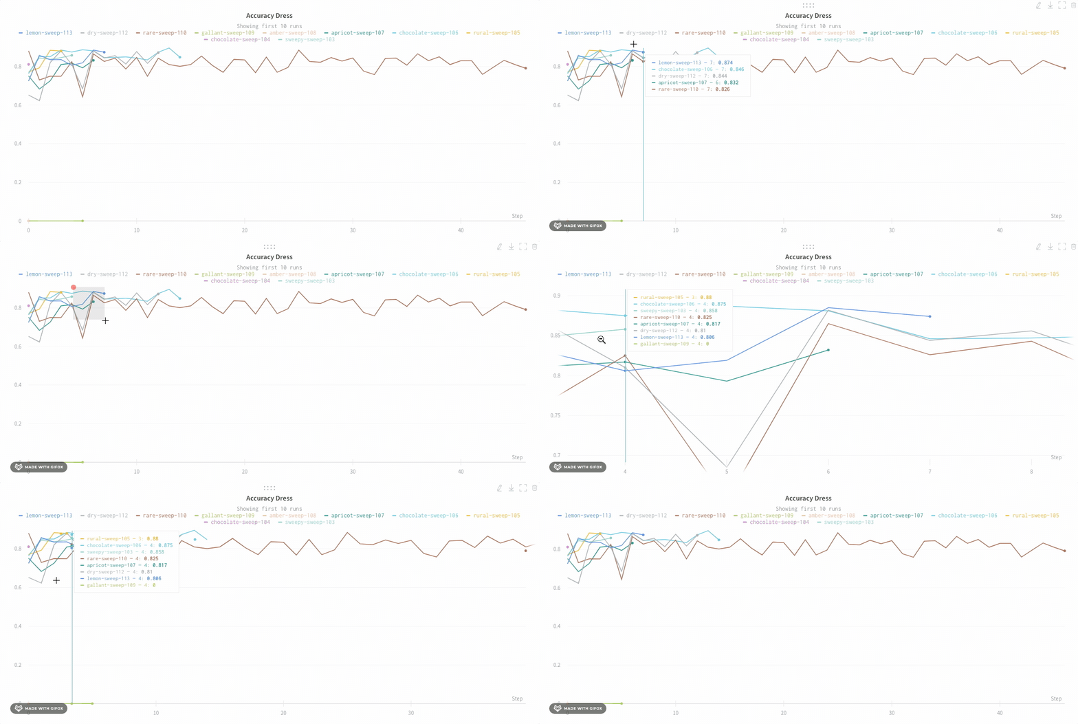
Click and drag a rectangle to zoom vertically and horizontally at the same time. This changes the x-axis and y-axis zoom.
Hide chart legend

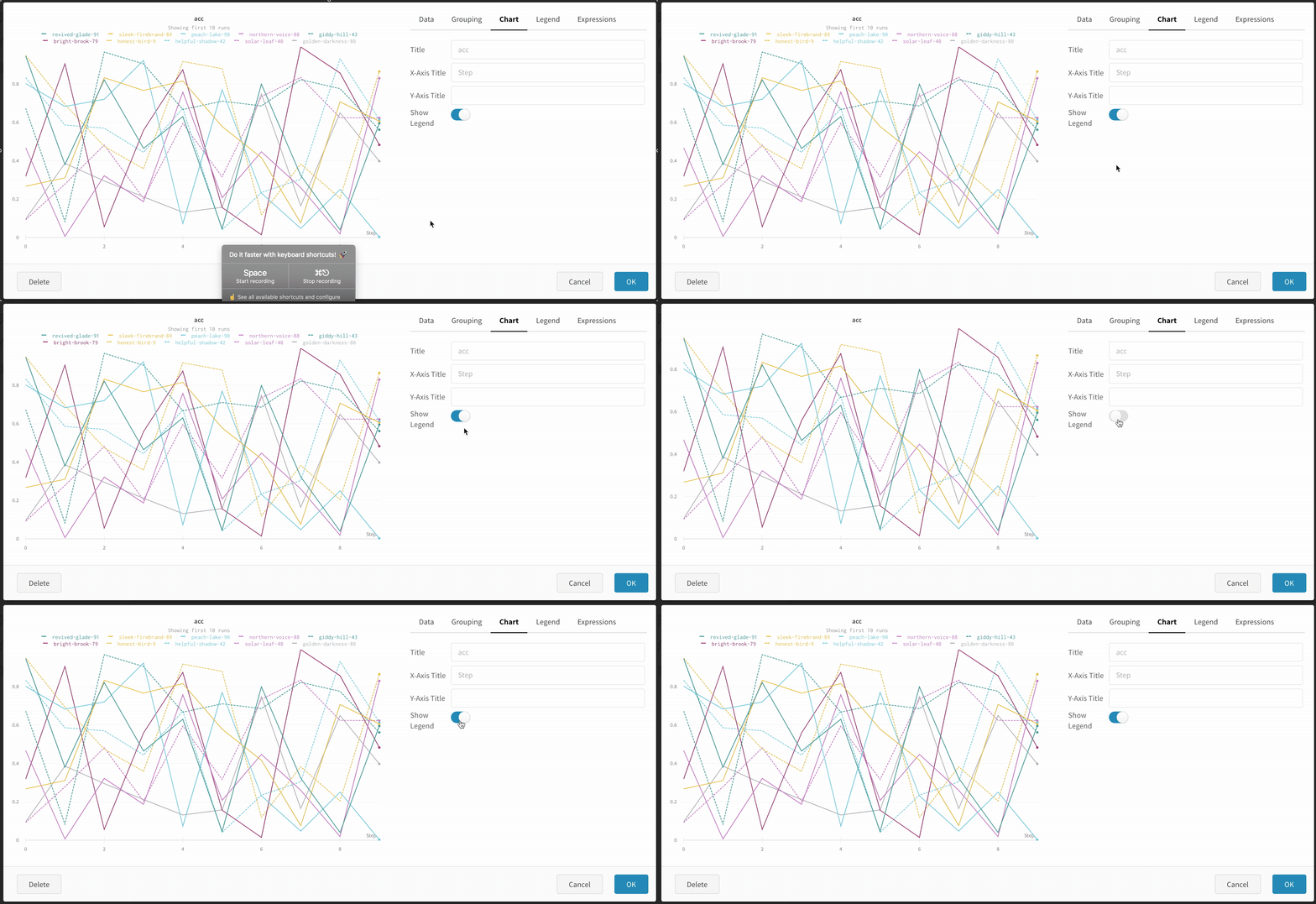
Turn off the legend in the line plot with this simple toggle:
1 - Line plot reference

X-Axis

Selecting X-Axis

You can set the x-axis of a line plot to any value that you have logged with W&B.log as long as it’s always logged as a number.

Y-Axis variables

You can set the y-axis variables to any value you have logged with wandb.log as long as you were logging numbers, arrays of numbers or a histogram of numbers. If you logged more than 1500 points for a variable, W&B samples down to 1500 points.

X range and Y range

You can change the maximum and minimum values of X and Y for the plot.

X range default is from the smallest value of your x-axis to the largest.

Y range default is from the smallest value of your metrics and zero to the largest value of your metrics.

Max runs/groups

By default you will only plot 10 runs or groups of runs. The runs will be taken from the top of your runs table or run set, so if you sort your runs table or run set you can change the runs that are shown.

Legend

You can control the legend of your chart to show for any run any config value that you logged and meta data from the runs such as the created at time or the user who created the run.

Example:

${run:displayName} - ${config:dropout} will make the legend name for each run something like royal-sweep - 0.5 where royal-sweep is the run name and 0.5 is the config parameter named dropout.

You can set value inside[[ ]] to display point specific values in the crosshair when hovering over a chart. For example \[\[ $x: $y ($original) ]] would display something like “2: 3 (2.9)”

Supported values inside [[ ]] are as follows:

Value Meaning
${x} X value
${y} Y value (Including smoothing adjustment)
${original} Y value not including smoothing adjustment
${mean} Mean of grouped runs
${stddev} Standard Deviation of grouped runs
${min} Min of grouped runs
${max} Max of grouped runs
${percent} Percent of total (for stacked area charts)

Grouping

You can aggregate all of the runs by turning on grouping, or group over an individual variable. You can also turn on grouping by grouping inside the table and the groups will automatically populate into the graph.

Smoothing

You can set the smoothing coefficient to be between 0 and 1 where 0 is no smoothing and 1 is maximum smoothing.

Ignore outliers

Ignore outliers sets the graph’s Y-axis range from 5% to 95%, rather than from 0% to 100% to make all data visible.

Expression

Expression lets you plot values derived from metrics like 1-accuracy. It currently only works if you are plotting a single metric. You can do simple arithmetic expressions, +, -, *, / and % as well as ** for powers.

Plot style

Select a style for your line plot.

Line plot:

Area plot:

Percentage area plot:

2 - Point aggregation

Use point aggregation methods within your line plots for improved data visualization accuracy and performance. There are two types of point aggregation modes: full fidelity and random sampling. W&B uses full fidelity mode by default.

Full fidelity

When you use full fidelity mode, W&B breaks the x-axis into dynamic buckets based on the number of data points. It then calculates the minimum, maximum, and average values within each bucket while rendering a point aggregation for the line plot.

There are three main advantages to using full fidelity mode for point aggregation:

  • Preserve extreme values and spikes: retain extreme values and spikes in your data
  • Configure how minimum and maximum points render: use the W&B App to interactively decide whether you want to show extreme (min/max) values as a shaded area.
  • Explore your data without losing data fidelity: W&B recalculate x-axis bucket sizes when you zoom into specific data points. This helps ensure that you can explore your data without losing accuracy. Caching is used to store previously computed aggregations to help reduce loading times which is particularly useful if you are navigating through large datasets.

Configure how minimum and maximum points render

Show or hide minimum and maximum values with shaded areas around your line plots.

The proceeding image shows a blue line plot. The light blue shaded area represents the minimum and maximum values for each bucket.

There are three ways to render minimum and maximum values in your line plots:

  • Never: The min/max values are not displayed as a shaded area. Only show the aggregated line across the x-axis bucket.
  • On hover: The shaded area for min/max values appears dynamically when you hover over the chart. This option keeps the view uncluttered while allowing you to inspect ranges interactively.
  • Always: The min/max shaded area is consistently displayed for every bucket in the chart, helping you visualize the full range of values at all times. This can introduce visual noise if there are many runs visualized in the chart.

By default, the minimum and maximum values are not displayed as shaded areas. To view one of the shaded area options, follow these steps:

  1. Navigate to your W&B project
  2. Select on the Workspace icon on the left tab
  3. Select the gear icon on the top right corner of the screen next to the left of the Add panels button.
  4. From the UI slider that appears, select Line plots
  5. Within the Point aggregation section, choose On over or Always from the Show min/max values as a shaded area dropdown menu.
  1. Navigate to your W&B project
  2. Select on the Workspace icon on the left tab
  3. Select the line plot panel you want to enable full fidelity mode for
  4. Within the modal that appears, select On hover or Always from the Show min/max values as a shaded area dropdown menu.

Explore your data without losing data fidelity

Analyze specific regions of the dataset without missing critical points like extreme values or spikes. When you zoom in on a line plot, W&B adjusts the buckets sizes used to calculate the minimum, maximum, and average values within each bucket.

W&B divides the x-axis is dynamically into 1000 buckets by default. For each bucket, W&B calculates the following values:

  • Minimum: The lowest value in that bucket.
  • Maximum: The highest value in that bucket.
  • Average: The mean value of all points in that bucket.

W&B plots values in buckets in a way that preserves full data representation and includes extreme values in every plot. When zoomed in to 1,000 points or fewer, full fidelity mode renders every data point without additional aggregation.

To zoom in on a line plot, follow these steps:

  1. Navigate to your W&B project
  2. Select on the Workspace icon on the left tab
  3. Optionally add a line plot panel to your workspace or navigate to an existing line plot panel.
  4. Click and drag to select a specific region to zoom in on.

Random sampling

Random sampling uses 1500 randomly sampled points to render line plots. Random sampling is useful for performance reasons when you have a large number of data points.

Enable random sampling

By default, W&B uses full fidelity mode. To enable random sampling, follow these steps:

  1. Navigate to your W&B project
  2. Select on the Workspace icon on the left tab
  3. Select the gear icon on the top right corner of the screen next to the left of the Add panels button.
  4. From the UI slider that appears, select Line plots
  5. Choose Random sampling from the Point aggregation section
  1. Navigate to your W&B project
  2. Select on the Workspace icon on the left tab
  3. Select the line plot panel you want to enable random sampling for
  4. Within the modal that appears, select Random sampling from the Point aggregation method section

Access non sampled data

You can access the complete history of metrics logged during a run using the W&B Run API. The following example demonstrates how to retrieve and process the loss values from a specific run:

# Initialize the W&B API
run = api.run("l2k2/examples-numpy-boston/i0wt6xua")

# Retrieve the history of the 'Loss' metric
history = run.scan_history(keys=["Loss"])

# Extract the loss values from the history
losses = [row["Loss"] for row in history]

3 - Smooth line plots

In line plots, use smoothing to see trends in noisy data.

W&B supports three types of smoothing:

See these live in an interactive W&B report.

Exponential Moving Average (Default)

Exponential smoothing is a technique for smoothing time series data by exponentially decaying the weight of previous points. The range is 0 to 1. See Exponential Smoothing for background. There is a de-bias term added so that early values in the time series are not biased towards zero.

The EMA algorithm takes the density of points on the line (the number of y values per unit of range on x-axis) into account. This allows consistent smoothing when displaying multiple lines with different characteristics simultaneously.

Here is sample code for how this works under the hood:

const smoothingWeight = Math.min(Math.sqrt(smoothingParam || 0), 0.999);
let lastY = yValues.length > 0 ? 0 : NaN;
let debiasWeight = 0;

return yValues.map((yPoint, index) => {
  const prevX = index > 0 ? index - 1 : 0;
  // VIEWPORT_SCALE scales the result to the chart's x-axis range
  const changeInX =
    ((xValues[index] - xValues[prevX]) / rangeOfX) * VIEWPORT_SCALE;
  const smoothingWeightAdj = Math.pow(smoothingWeight, changeInX);

  lastY = lastY * smoothingWeightAdj + yPoint;
  debiasWeight = debiasWeight * smoothingWeightAdj + 1;
  return lastY / debiasWeight;
});

Here’s what this looks like in the app:

Gaussian Smoothing

Gaussian smoothing (or gaussian kernel smoothing) computes a weighted average of the points, where the weights correspond to a gaussian distribution with the standard deviation specified as the smoothing parameter. See . The smoothed value is calculated for every input x value.

Gaussian smoothing is a good standard choice for smoothing if you are not concerned with matching TensorBoard’s behavior. Unlike an exponential moving average the point will be smoothed based on points occurring both before and after the value.

Here’s what this looks like in the app:

Running Average

Running average is a smoothing algorithm that replaces a point with the average of points in a window before and after the given x value. See “Boxcar Filter” at https://en.wikipedia.org/wiki/Moving_average. The selected parameter for running average tells Weights and Biases the number of points to consider in the moving average.

Consider using Gaussian Smoothing if your points are spaced unevenly on the x-axis.

The following image demonstrates how a running app looks like in the app:

Exponential Moving Average (Deprecated)

The TensorBoard EMA algorithm has been deprecated as it cannot accurately smooth multiple lines on the same chart that do not have a consistent point density (number of points plotted per unit of x-axis).

Exponential moving average is implemented to match TensorBoard’s smoothing algorithm. The range is 0 to 1. See Exponential Smoothing for background. There is a debias term added so that early values in the time series are not biases towards zero.

Here is sample code for how this works under the hood:

  data.forEach(d => {
    const nextVal = d;
    last = last * smoothingWeight + (1 - smoothingWeight) * nextVal;
    numAccum++;
    debiasWeight = 1.0 - Math.pow(smoothingWeight, numAccum);
    smoothedData.push(last / debiasWeight);

Here’s what this looks like in the app:

Implementation Details

All of the smoothing algorithms run on the sampled data, meaning that if you log more than 1500 points, the smoothing algorithm will run after the points are downloaded from the server. The intention of the smoothing algorithms is to help find patterns in data quickly. If you need exact smoothed values on metrics with a large number of logged points, it may be better to download your metrics through the API and run your own smoothing methods.

Hide original data

By default we show the original, unsmoothed data as a faint line in the background. Click the Show Original toggle to turn this off.