This page provides comprehensive details for line plot settings. For more details about working with line plots, see the Line plots overview.
Data settings
X-axis
Set the range of the x-axis to any integer or float value you logged with wandb.Run.log().
Available time-based x-axis options:
- Step: Increments each time
wandb.Run.log() is called. Reflects the number of training steps logged from your model. (Default)
- Relative Time (Wall): Clock time since the process started. If you start a run, pause it for a day, then resume and log, that point appears at 24 hours.
- Relative Time (Process): Time inside the running process. If you start a run, run for 10 seconds, pause for a day, then resume, that point appears at 10 seconds.
- Wall Time: Minutes elapsed since the start of the first run on the graph.
- X range: From the smallest to largest value of your x-axis by default. You can customize the minimum and maximum values.
Y-axis
Set the y-axis variables to any integer or float value you logged withwandb.Run.log(). Specify a single value, array of values, or histogram of values. If you logged more than 1500 points for a variable, W&B samples down to 1500 points.
Customize the color of your y-axis lines by changing the run color in the runs table.
- Y range: Default is from the smallest positive value of your metrics (inclusive of 0) to the largest value of your metrics. You can customize the minimum and maximum values.
Point aggregation method
Choose the sampling mode for displaying data points:
Smoothing
Set the smoothing coefficient between 0 and 1, where 0 is no smoothing and 1 is maximum smoothing.
Available smoothing methods:
- Time weighted EMA (default): a technique for smoothing time series data by exponentially decaying the weight of previous points.
- Running average: replaces a point with the average of points in a window before and after the given x value.
- Gaussian: computes a weighted average of the points, where the weights correspond to a gaussian distribution with the standard deviation specified as the smoothing parameter.
- No smoothing
For comprehensive details, see Smooth line plots.
Ignore outliers
Rescale the plot to exclude outliers from the default plot min and max scale. The setting’s impact depends on the plot’s sampling mode:
- Random sampling mode: Ignoring outliers omits points below 5% and above 95% from the plot.
- Full fidelity mode: Ignoring outliers shows all points, condensed down to the last value in each bucket, and shades the area below 5% and above 95%.
Max runs or groups
By default, plots include only the first 10 runs or groups of runs in the run list or run set. Change the sort order to control which runs or groups to display.
A workspace is limited to displaying a maximum of 1000 runs, regardless of its configuration.
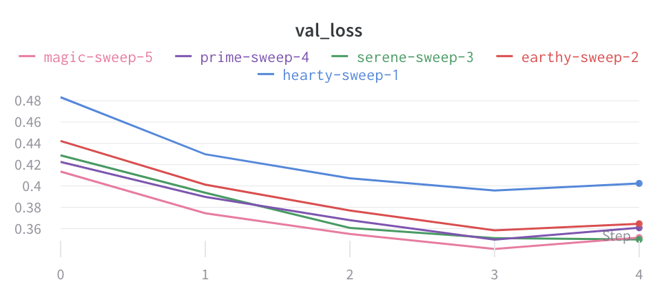
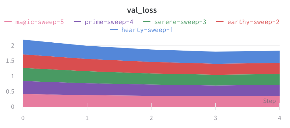
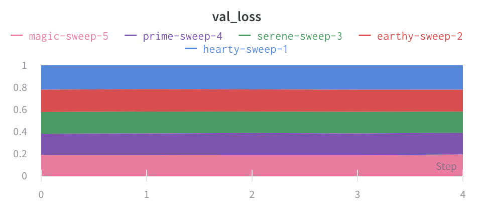
Chart type
Choose the plot style:
- Line plot
- Area plot
- Percentage area plot:
Configure the chart type in the Data tab. Refer to .
Grouping settings
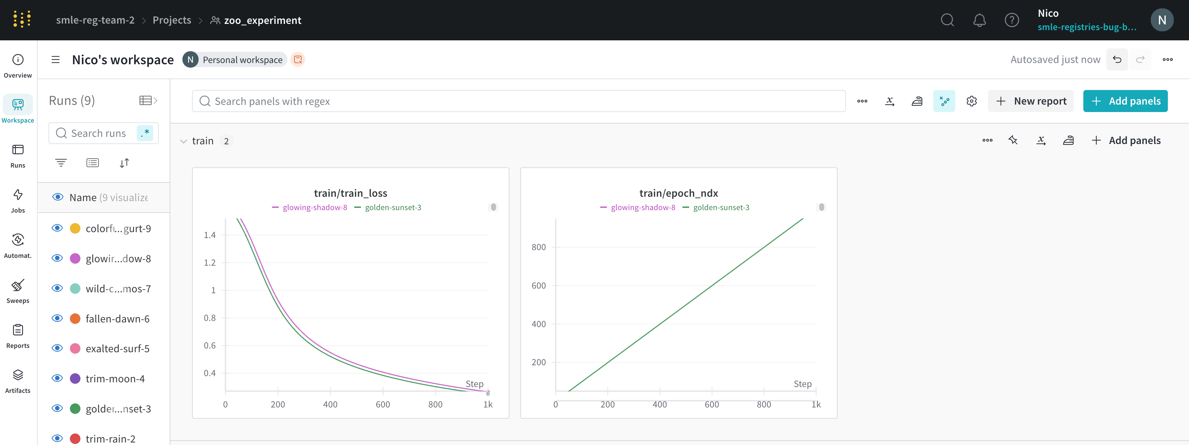
Aggregate all runs by turning on grouping, or group over an individual variable. When you turn on grouping in the runs table, the groups automatically populate into the graph.
- Group runs: Turn on run grouping in the plot. Required to configure the shaded range in the plot, below.
- Group by: Optionally select a column. All runs with the same value in that column are grouped together.
- Aggregation: The value of the line on the graph. Options are mean, median, min, and max of the group.
- Range: Configure the shaded area of a full-fidelity line plot. Options are Min/Max, Std Dev, Std Err or None.
Chart settings
Configure titles and legend visibility:
- Panel title: Title displayed at the top of the panel.
- X-axis title: Label for the x-axis.
- Y-axis title: Label for the y-axis.
- Legend: Show or hide the legend, and configure its position.
Legend settings
Customize the legend to show any config value logged and metadata from the runs, such as creation time or the user who created the run.
Legend template
Define a template for the legend name.
- Click the gear icon to open the plot settings.
- Go to the Display preferences tab.
- Expand Advanced legend, then specify the legend template.
- Click Apply.
Point-specific values
Set values inside [[ ]] to display point-specific values in the crosshair when hovering over a chart.
- Click the gear icon to open the plot settings.
- Go to the Display preferences tab.
- At the bottom of the tab, configure point-specific values for one or more of the plot’s metrics.
- Click Apply.
Supported values inside [[ ]]:
| Value | Meaning |
|---|
${x} | X value |
${y} | Y value (including smoothing adjustment) |
${original} | Y value not including smoothing adjustment |
${mean} | Mean of grouped runs |
${stddev} | Standard deviation of grouped runs |
${min} | Min of grouped runs |
${max} | Max of grouped runs |
${percent} | Percent of total (for stacked area charts) |
Expressions
Formulate math expressions to create or transform line plots from your logged metrics, config values, and summary statistics. For example, you can compute the difference between two metrics, rescale a metric by a config value, or plot the logarithm of a metric. Expressions are evaluated at each step that you log.
The following sections show how to reference values in expressions and describe the operators and functions you can use in custom expressions. In a line plot, you can use an expression for the x axis, y axis, or both.
See the Example expressions section below for common use cases and example expressions.
Create new line plots with expressions
- Navigate to your project’s workspace.
- Click the + Add panel button and select Line plot.
- Click the Data tab. Select the data you want to plot on the line plot for both the x and y axes.
- Click on the Expressions tab.
- In the Y-axis field or X-axis field, enter your expression.
- Click Apply to save your settings and view the line plot.
- Open the line plot you want to transform.
- Click the gear icon in the upper right corner of the plot to edit the panel.
- Click on the Expressions tab.
- In the Y-axis field or X-axis field, enter your expression.
- Click Apply to save your settings and view the updated line plot.
Referencing values
The following table describes how to reference logged metrics, config parameters, and summary statistics in line plot expressions.
| Type | Syntax | Description | Examples |
|---|
| Metric | ${metric_name} | Reference a logged metric by name. | ${val/accuracy}, ${"accuracy"} |
| Config parameter | ${config:param_name} | Reference config values using the ${config:} prefix. | ${config:lr}, ${config:batch_size} |
| Summary statistic | ${summary:stat_name} | Reference summary fields using the summary: prefix | ${summary:final_accuracy}, ${summary:best_loss} |
${...} to escape any metric name, config parameter, or summary field that includes special characters or spaces such as /, -, or spaces.
For example, if you log a metric named val/accuracy, reference it as ${val/accuracy} to avoid confusion with the division operator. If you log a config parameter named dropout-rate, reference it as ${config:dropout-rate}. If you log a summary field named best loss, reference it as ${summary:best loss}.
Nested configs
Acccess nested config values using dot notation and the following syntax:
${config:parent.child.grandchild}
parent, child, and grandchild are the keys in the nested config dictionary.
For example, suppose you log the following config with nested dictionaries:
config = {
    "model": {
        "type": "resnet",
        "layers": 50
    },
    "training": {
        "batch_size": 32,
        "learning_rate": 0.001
    }
}

with wandb.init(project="my-project", config=config) as run:
    ...
${config:model.type}. Reference the batch size with: ${config:training.batch_size}.
As another example, consider the following config with nested dictionaries:
config:
  optimizer:
    value:
      lr: 0.001
      weight_decay: 0.01
  model:
    value:
      hidden_size: 768
${config:optimizer.value.lr}, the model’s hidden size with ${config:model.value.hidden_size}, or the weight decay with ${config:optimizer.value.weight_decay}.
Available operators
W&B supports the following operators for line plot expressions:
| Category | Operators |
|---|
| Arithmetic | +, -, *, /, % (modulo), ** (exponent) |
| Comparison | ==, !=, ===, !==, <, >, <=, >= |
| Bitwise | |, ^, &, <<, >>, >>> |
| Logical | || , && |
Math constants and functions
All JavaScript math functions and constants are supported. For more details, see the MDN Math documentation. The following tables summarize the most commonly used functions and constants for line plot expressions.
Math constants
| Constant | Description |
|---|
e | Euler’s number |
pi | Pi |
ln2 | Natural logarithm of 2 |
ln10 | Natural logarithm of 10 |
log2e | Base-2 logarithm of e |
log10e | Base-10 logarithm of e |
sqrt2 | Square root of 2 |
sqrt1_2 | Square root of 1/2 |
Arithmetic and statistical functions
The following table describes available arithmetic and statistical functions:
| Function | Description |
|---|
| abs(x) | Absolute value |
| ceil(x) | Ceiling function (round up to nearest integer) |
| floor(x) | Floor function (round down to nearest integer) |
| round(x) | Round to nearest integer |
| min(x, y, …) | Minimum value |
| max(x, y, …) | Maximum value |
| sqrt(x) | Square root |
Logarithmic and exponential functions
The following table describes available logarithmic and exponential functions:
| Function | Description |
|---|
| log(x) | Natural logarithm (base e) |
| log10(x) | Base-10 logarithm |
| log2(x) | Base-2 logarithm |
| exp(x) | Exponential function (e^x) |
| pow(x, y) | Power function (x^y) |
Trigonometric functions
The following table describes available trigonometric functions:
| Function | Description |
|---|
| sin(x) | Sine |
| cos(x) | Cosine |
| tan(x) | Tangent |
| asin(x) | Arc sine (inverse sine) |
| acos(x) | Arc cosine (inverse cosine) |
| atan(x) | Arc tangent (inverse tangent) |
| atan2(y, x) | Two-argument arc tangent |
Hyperbolic functions
The following table describes available hyperbolic functions:
| Function | Description |
|---|
| sinh(x) | Hyperbolic sine |
| cosh(x) | Hyperbolic cosine |
| tanh(x) | Hyperbolic tangent |
Example expressions
The following are example expressions for line plot axes. These examples are for illustrative purposes. You can use any combination of operators and functions described in the previous sections to create complex expressions that suit your needs.
For the following examples, suppose your summary metrics include accuracy and loss with the following values:
{
  "accuracy": 0.7829240801794489,
  "loss": 0.2194763318905079
}
config = {
    "epochs": 100,
    "optimizer": {
        "value": {
            "lr": 0.001,
            "weight_decay": 0.01
        }
    }
}
lr):
accuracy+${config:optimizer.value.lr}
batch_size:
${accuracy} / ${config:batch_size}
sqrt(loss ** 2 + accuracy ** 2)
sqrt(loss*100)+sqrt(loss*100000)
You can also refer to summary metric values with ${summary:metric_name} syntax in expressions. For example:sqrt(${summary:loss}*100)+sqrt(${summary:loss}*100000)
Multi-metric panel expressions
Use a regular expression to create a single line plot that shows multiple metrics together (including matching metrics logged in the future). For detailed instructions, see Add a line plot.
For example:
- Instead of creating separate panels for each layer’s metrics, you can view them together in a single panel. For example, if you log metrics with consistent naming, like
layer_0_loss, layer_1_loss, and layer_2_loss, you can use a regex like layer_\d+_loss to display all layer losses on one plot.
- Match all metrics that share a common naming pattern. For example:
train_.* matches all training metrics like train_loss, train_accuracy, train_f1_score.*_accuracy matches accuracy metrics across different datasets like train_accuracy, val_accuracy, test_accuracy
- Use alternation to match only the metrics you want. For example, the non-capture group
(?:layer_0|layer_10)_loss matches only the first and tenth layer losses, excluding intermediate layers.
Capture groups
Capture groups in your regular expression control how multi-metric panels are created. This behavior can be confusing if you’re not expecting it.
-
Capture groups create multiple panels
When your regular expression includes parentheses that form a capture group, the UI creates a separate panel for each unique value captured by that group.
For example, the expression
(layer_0|layer_10)_loss includes a capture group and will create two separate panels:
- One panel for metrics matching
layer_0.
- One panel for metrics matching
layer_10.
-
Non-capturing groups keep metrics together
To match multiple alternatives without creating separate panels, use a non-capturing group with the
?: syntax. The expression (?:layer_0|layer_10)_loss matches the same metrics as the previous example, but displays them together in a single panel.
Here’s the difference:
(layer_0|layer_10)_loss - Creates two panels, one for each layer.(?:layer_0|layer_10)_loss - Creates one panel showing both layers together.
This gives you flexibility to choose the approach that best fits your analysis needs. Use capture groups when you want to separate metrics into distinct panels. Use non-capturing groups when you want to compare metrics together on a single plot.