

Use case
Use scatter plots to compare multiple runs and visualize the performance of an experiment. With a scatter plot, you can:- Plot lines for minimum, maximum, and average values.
- Customize metadata tooltips.
- Control point colors.
- Adjust axis ranges.
- Use a log scale for the axes.
- Configure how the frontier line and related points are labeled and emphasized. See Frontier line display options.
Example
The following example shows a scatter plot displaying validation accuracy for different models over several weeks of experimentation. The tooltip includes batch size, dropout, and axis values. A line also shows the running average of validation accuracy. See a live example →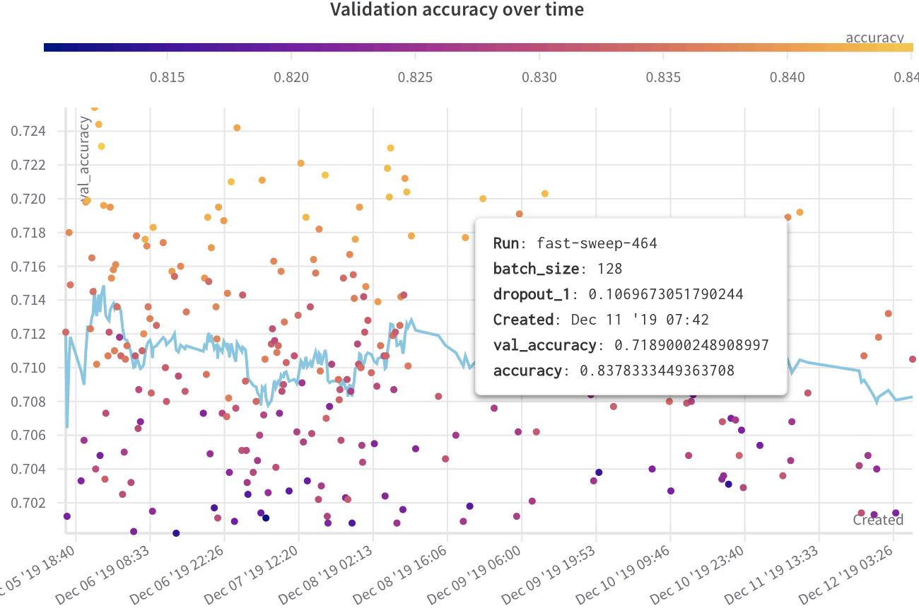
Create a scatter plot
To create a scatter plot in the W&B UI:- Navigate to the Workspaces tab.
- In the Charts panel, click the action () menu.
- From the pop-up menu, select Add panels.
- In the Add panels menu, select Scatter plot.
- Set the
xandyaxes to plot the data you want to view. Optionally, set maximum and minimum ranges for your axes or add azaxis. - Click Apply to create the scatter plot.
Frontier line display options
The frontier line on a scatter plot connects the highest and lowest y-axis values observed so far for the data in the plot. You can tune how the line and the surrounding points appear from the plot settings to emphasize the frontier. To configure frontier line display options:- Hover over the scatter plot panel, then click the gear icon to open the panel settings drawer.
- Select the Annotations tab.
- Set the options:
- Show run labels: Toggle whether to show a label with the run name or group name.
- Dim non-frontier points: Toggle whether to reduce the visual weight of points that aren’t on the frontier line so the frontier stands out.
- Click Apply to save your changes.