PyTorch Geometric

PyTorch Geometric or PyG is one of the most popular libraries for geometric deep learning and W&B works extremely well with it for visualizing graphs and tracking experiments.

After you have installed Pytorch Geometric, follow these steps to get started.

Sign up and create an API key

An API key authenticates your machine to W&B. You can generate an API key from your user profile.

  1. Click your user profile icon in the upper right corner.
  2. Select User Settings, then scroll to the API Keys section.
  3. Click Reveal. Copy the displayed API key. To hide the API key, reload the page.

Install the wandb library and log in

To install the wandb library locally and log in:

  1. Set the WANDB_API_KEY environment variable to your API key.

    export WANDB_API_KEY=<your_api_key>
    
  2. Install the wandb library and log in.

    pip install wandb
    
    wandb login
    
pip install wandb
import wandb
wandb.login()
!pip install wandb

import wandb
wandb.login()

Visualize the graphs

You can save details about the input graphs including number of edges, number of nodes and more. W&B supports logging plotly charts and HTML panels so any visualizations you create for your graph can then also be logged to W&B.

Use PyVis

The following snippet shows how you could do that with PyVis and HTML.
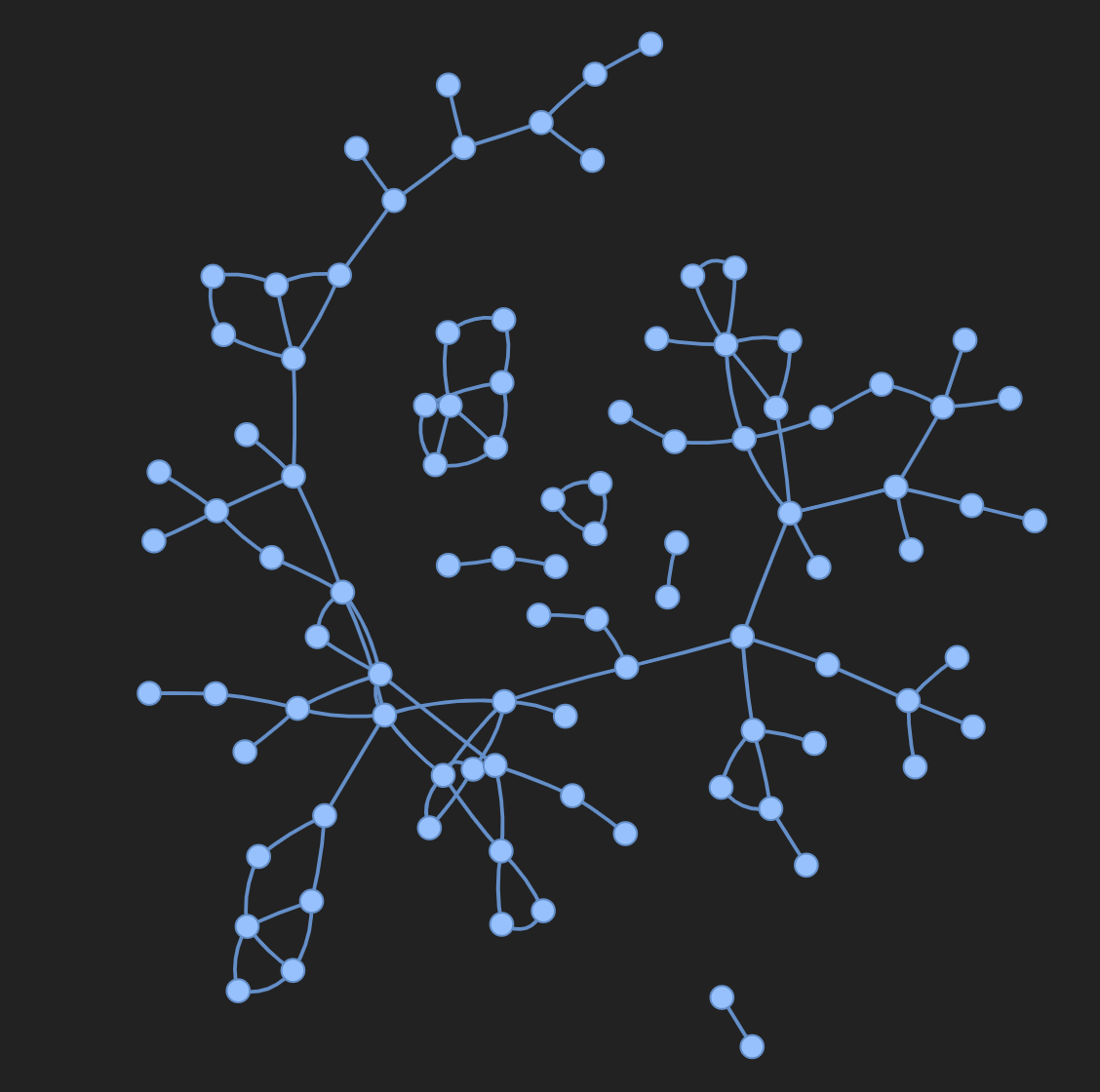
from pyvis.network import Network
Import wandb

wandb.init(project=graph_vis)
net = Network(height="750px", width="100%", bgcolor="#222222", font_color="white")

# Add the edges from the PyG graph to the PyVis network
for e in tqdm(g.edge_index.T):
    src = e[0].item()
    dst = e[1].item()

    net.add_node(dst)
    net.add_node(src)
    
    net.add_edge(src, dst, value=0.1)

# Save the PyVis visualisation to a HTML file
net.show("graph.html")
wandb.log({"eda/graph": wandb.Html("graph.html")})
wandb.finish()
This image shows the input graph as an interactive HTML visualization.

Use Plotly

To use plotly to create a graph visualization, first you need to convert the PyG graph to a networkx object. Following this you will need to create Plotly scatter plots for both nodes and edges. The snippet below can be used for this task.
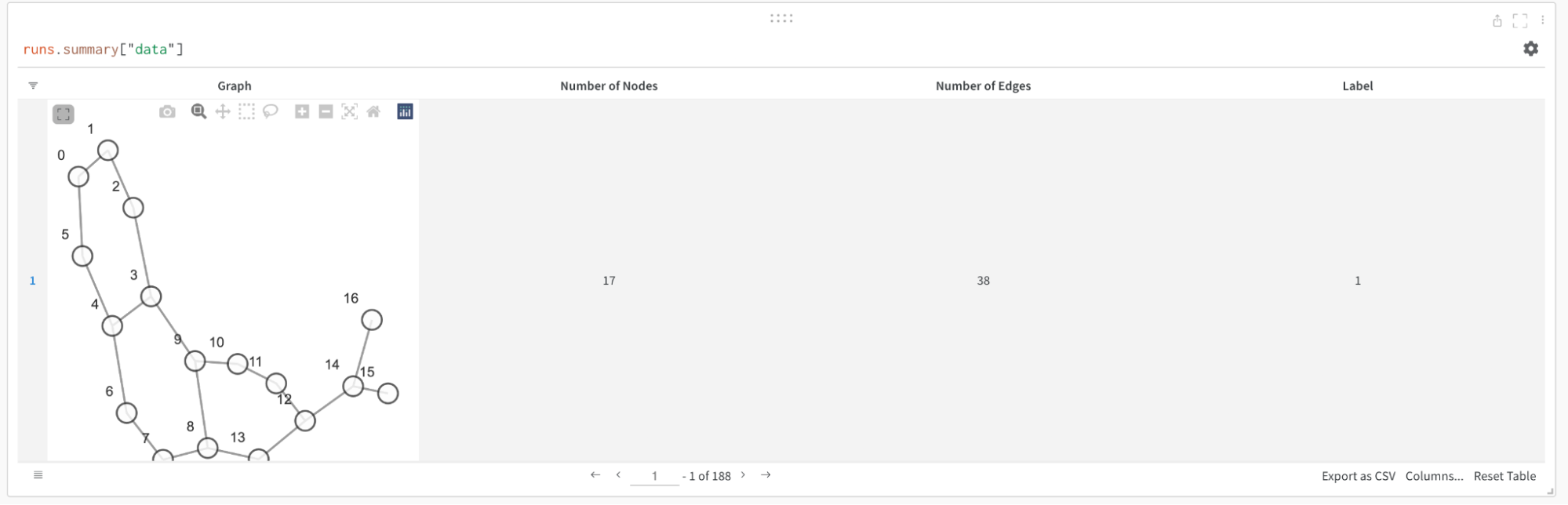
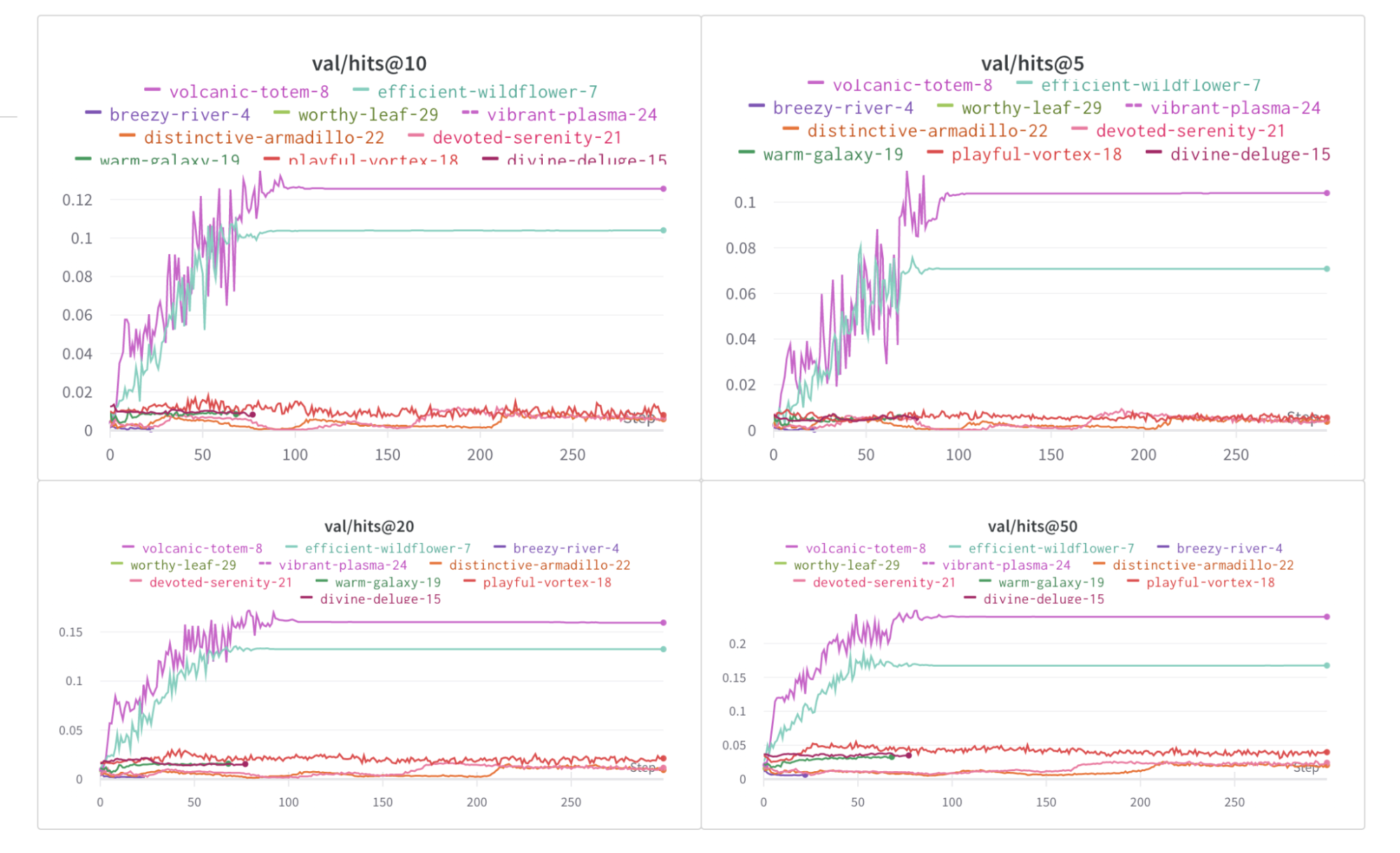
def create_vis(graph):
    G = to_networkx(graph)
    pos = nx.spring_layout(G)

    edge_x = []
    edge_y = []
    for edge in G.edges():
        x0, y0 = pos[edge[0]]
        x1, y1 = pos[edge[1]]
        edge_x.append(x0)
        edge_x.append(x1)
        edge_x.append(None)
        edge_y.append(y0)
        edge_y.append(y1)
        edge_y.append(None)

    edge_trace = go.Scatter(
        x=edge_x, y=edge_y,
        line=dict(width=0.5, color='#888'),
        hoverinfo='none',
        mode='lines'
    )

    node_x = []
    node_y = []
    for node in G.nodes():
        x, y = pos[node]
        node_x.append(x)
        node_y.append(y)

    node_trace = go.Scatter(
        x=node_x, y=node_y,
        mode='markers',
        hoverinfo='text',
        line_width=2
    )

    fig = go.Figure(data=[edge_trace, node_trace], layout=go.Layout())

    return fig


wandb.init(project=visualize_graph)
wandb.log({graph: wandb.Plotly(create_vis(graph))})
wandb.finish()
A visualization created using the example function and logged inside a W&B Table.

Log metrics

You can use W&B to track your experiments and related metrics, such as loss functions, accuracy, and more. Add the following line to your training loop:

wandb.log({
	train/loss: training_loss,
	train/acc: training_acc,
	val/loss: validation_loss,
	val/acc: validation_acc
})
Plots from W&B showing how the hits@K metric changes over epochs for different values of K.

More resources


Last modified February 13, 2025: a09c831