Visualize the results of your W&B Sweeps with the W&B App UI.
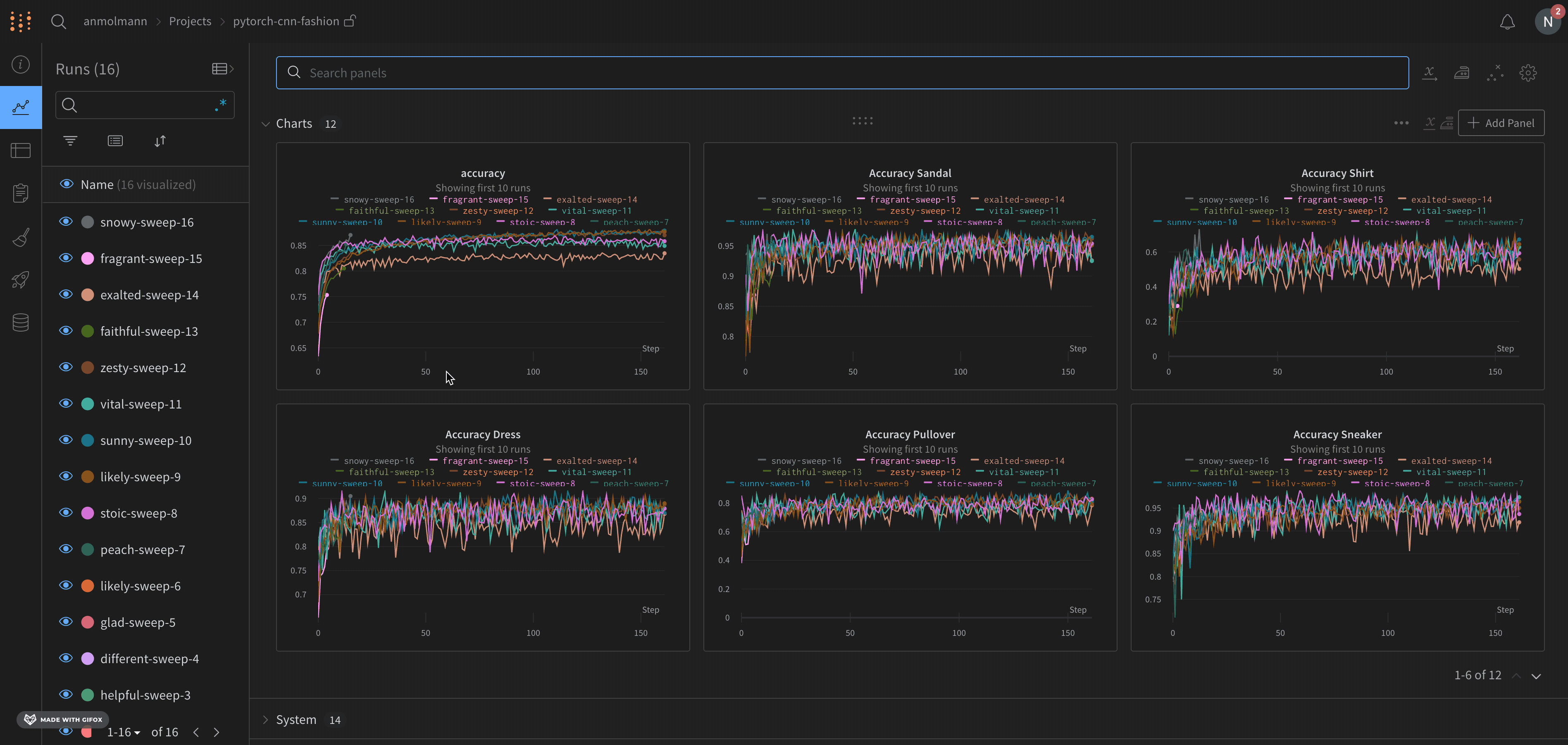
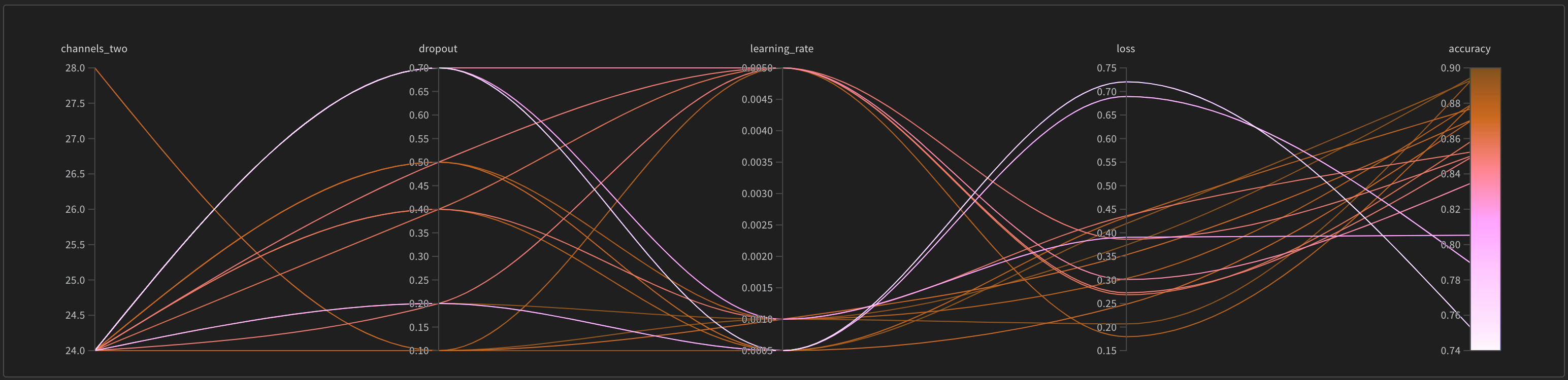
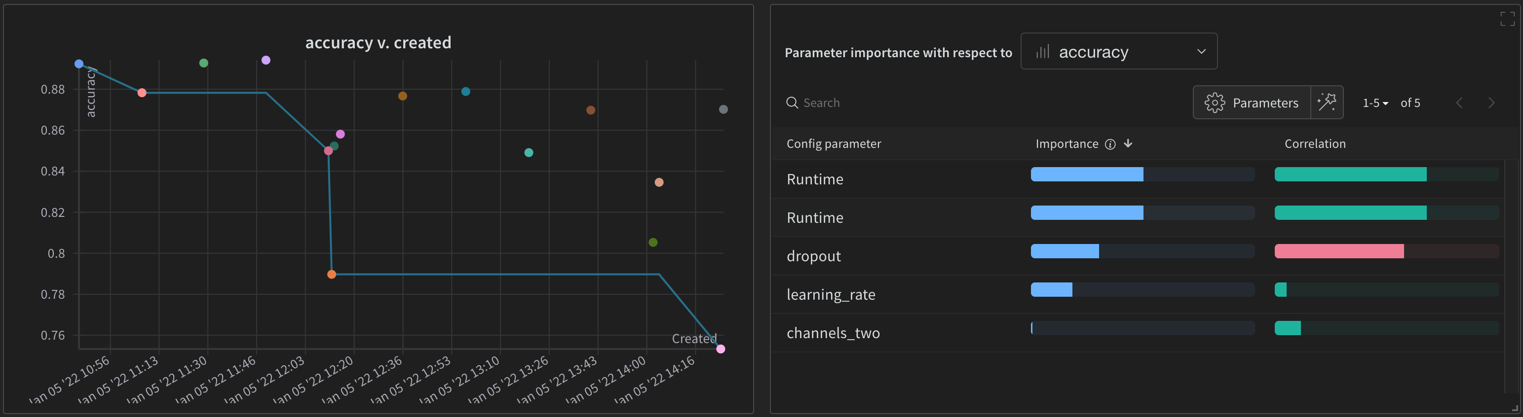
Visualize the results of your W&B Sweeps with the W&B App. Navigate to the W&B App. Choose the project that you specified when you initialized a sweep. You will be redirected to your project workspace. Select the Sweep icon in the project sidebar (broom icon). From the Sweep UI, select the name of your Sweep from the list.The sweep list shows each sweep’s state (State), creation time (Created), who started it (Creator), how many runs finished (Run count), and total Compute time. For a grid search over a discrete search space, W&B also shows Est. Runs (the expected number of runs). Open a sweep from the list to pause, resume, stop, or kill it from the app. For the same controls with the CLI, see Manage sweeps.By default, W&B will automatically create a parallel coordinates plot, a parameter importance plot, and a scatter plot when you start a W&B Sweep job.
Parallel coordinates charts summarize the relationship between large numbers of hyperparameters and model metrics at a glance. For more information on parallel coordinates plots, see Parallel coordinates.
The scatter plot(left) compares the W&B Runs that were generated during the Sweep. For more information about scatter plots, see Scatter Plots.The parameter importance plot(right) lists the hyperparameters that were the best predictors of, and highly correlated to desirable values of your metrics. For more information on parameter importance plots, see Parameter Importance.
You can alter the dependent and independent values (x and y axis) that are automatically used. Within each panel there is a pencil icon called Edit panel. Choose Edit panel. A model will appear. Within the modal, you can alter the behavior of the graph.For more information on all default W&B visualization options, see Panels. See the Data Visualization docs for information on how to create plots from W&B Runs that are not part of a W&B Sweep.